
The Friendly Network: Brand Strategy & Design
Case Study: Brand strategy, brand design and tone of voice creation for a brand new ethical social media app.
THE BRIEF
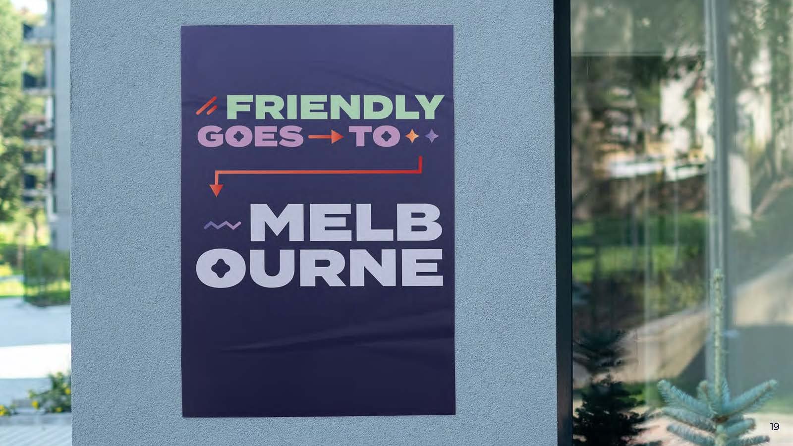
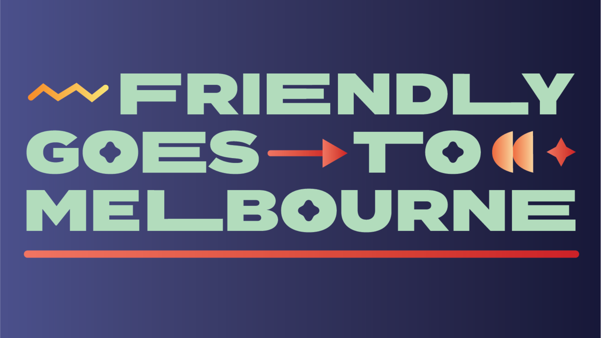
Friendly is an up-and-coming social media app aimed at a Melbourne audience aged 18 to 28. The app is an ethical social platform which encourages users to connect with other like-minded people and meet up in real life. The app has social components as well as maps and tools to aid in setting up Friendly meet-ups.
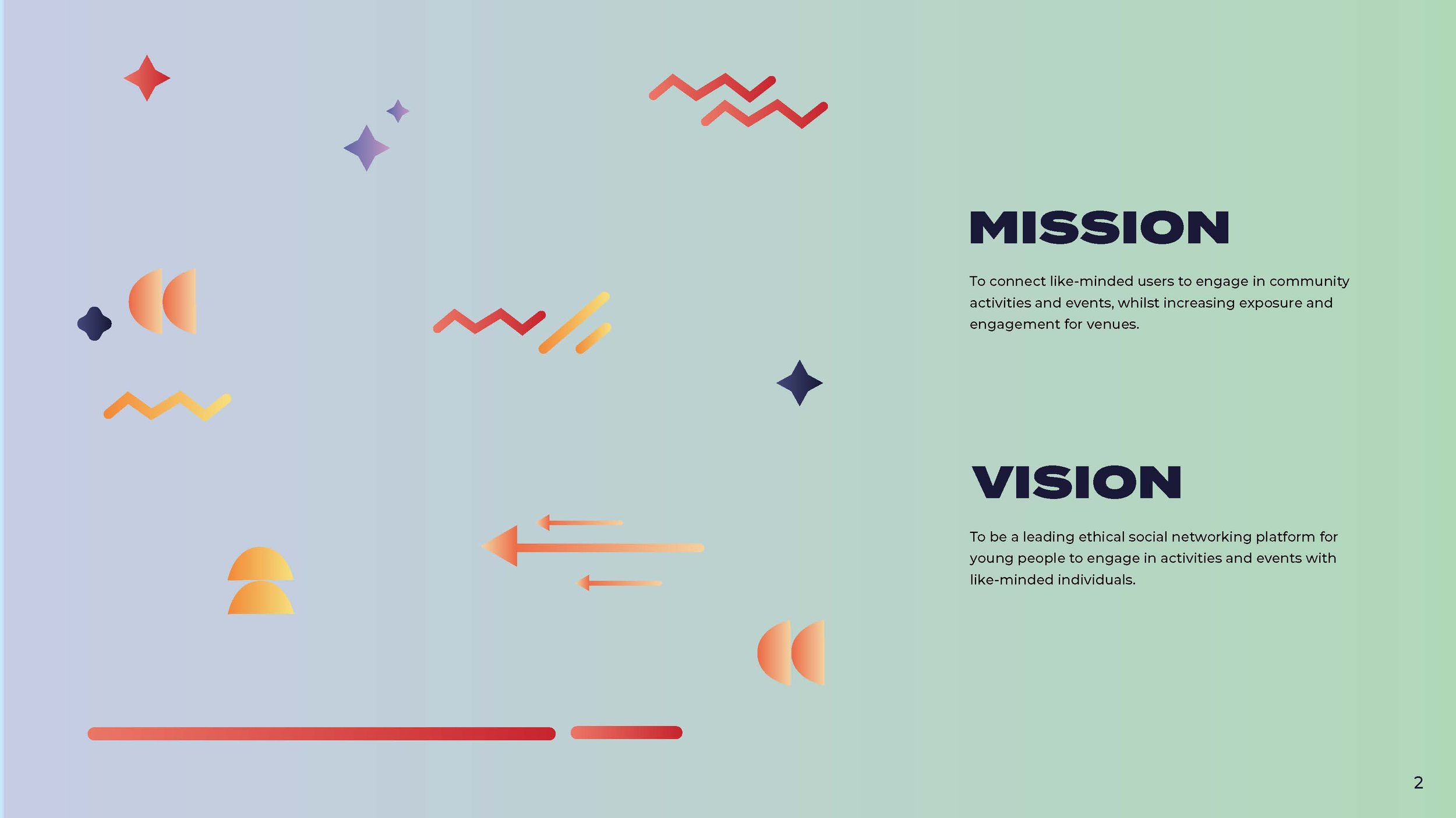
Our task was to provide a brand strategy, visual brand identity and tone of voice direction for The Friendly Network. These documents would be crucial in the development of their website and launch campaigns with MJS going forward.
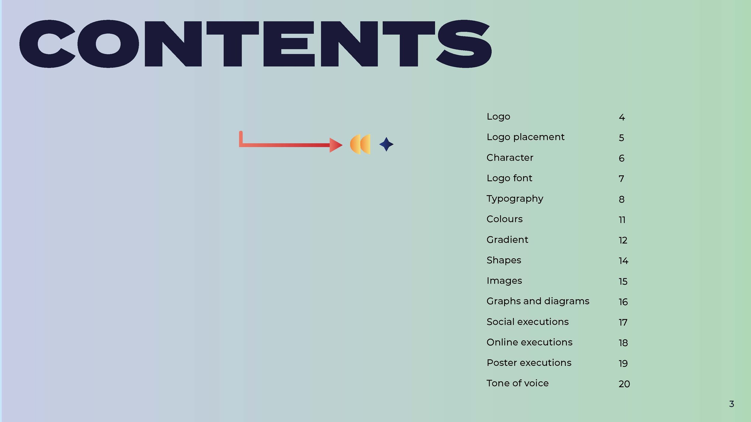
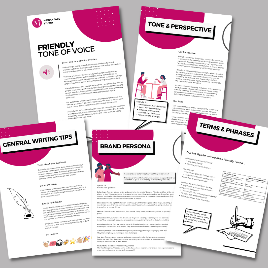
BRAND BOOK CREATION
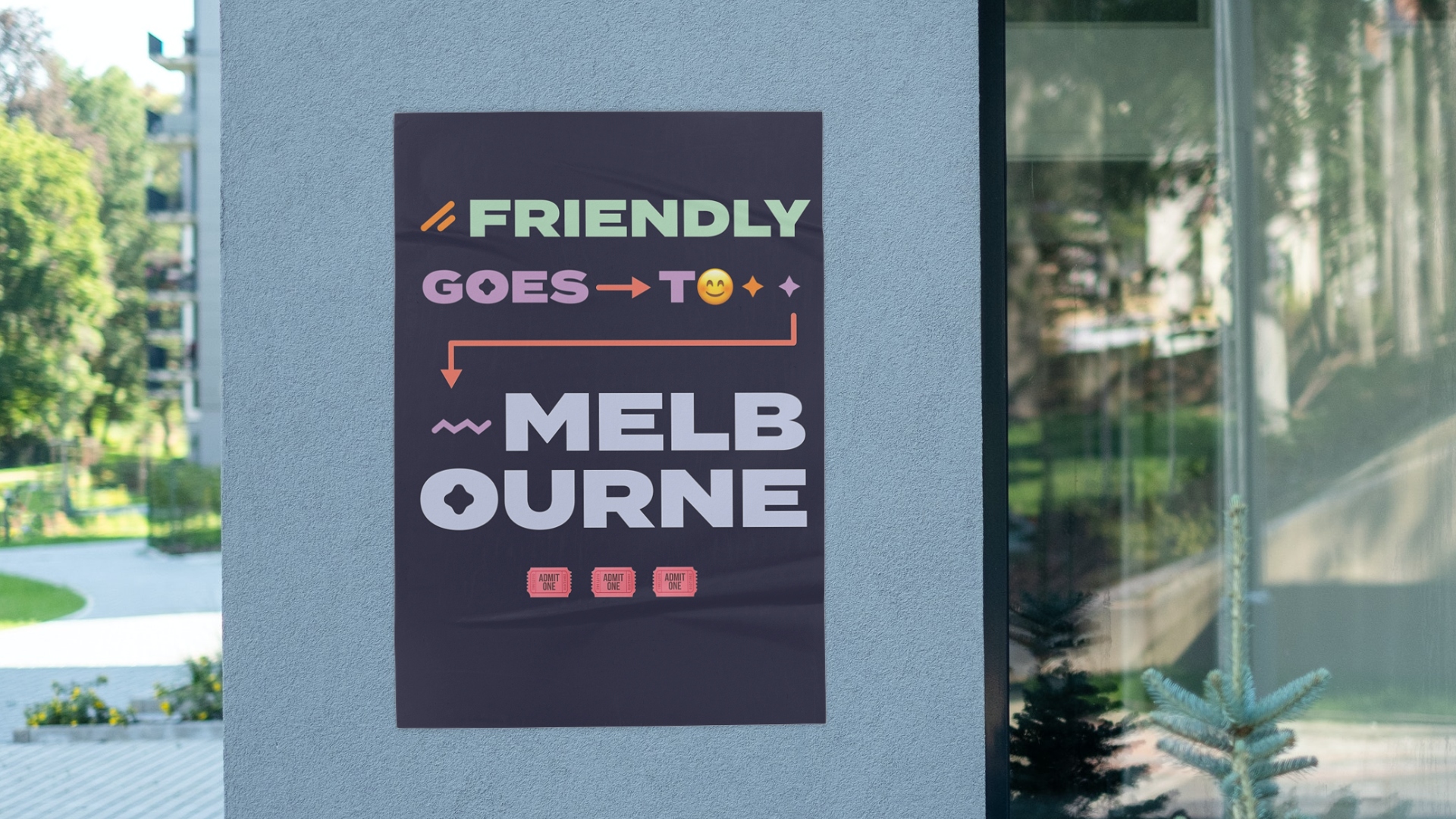
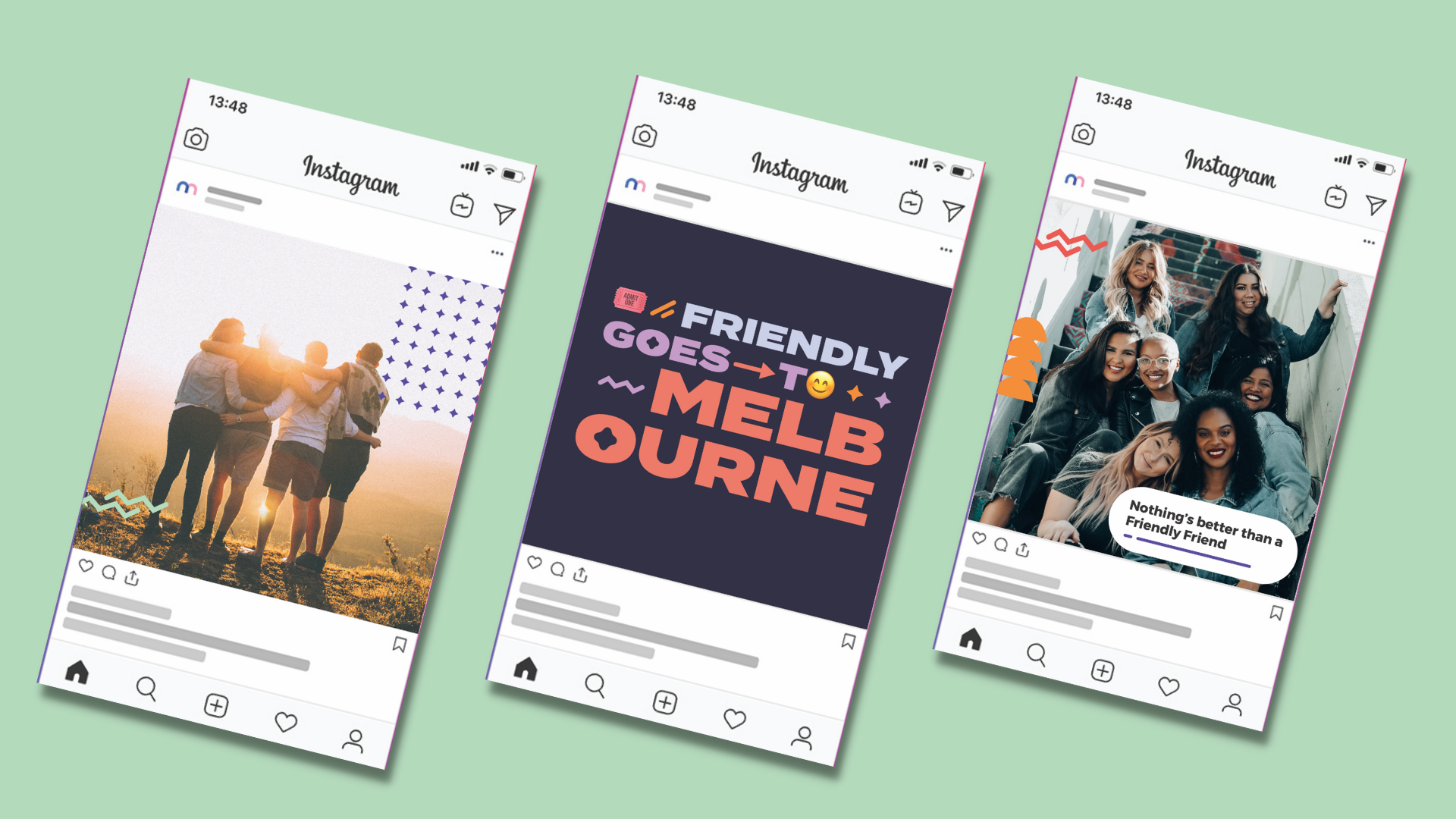
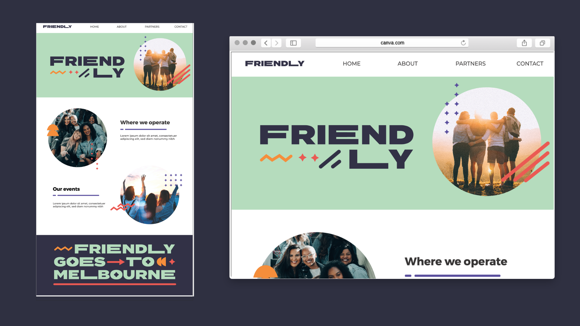
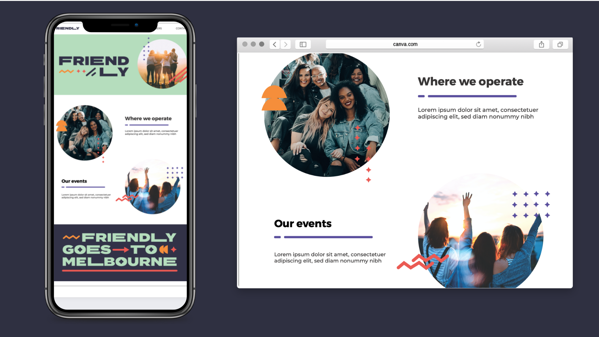
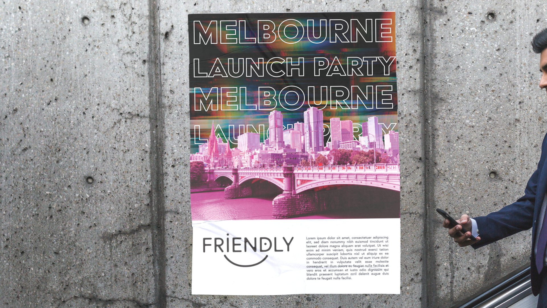
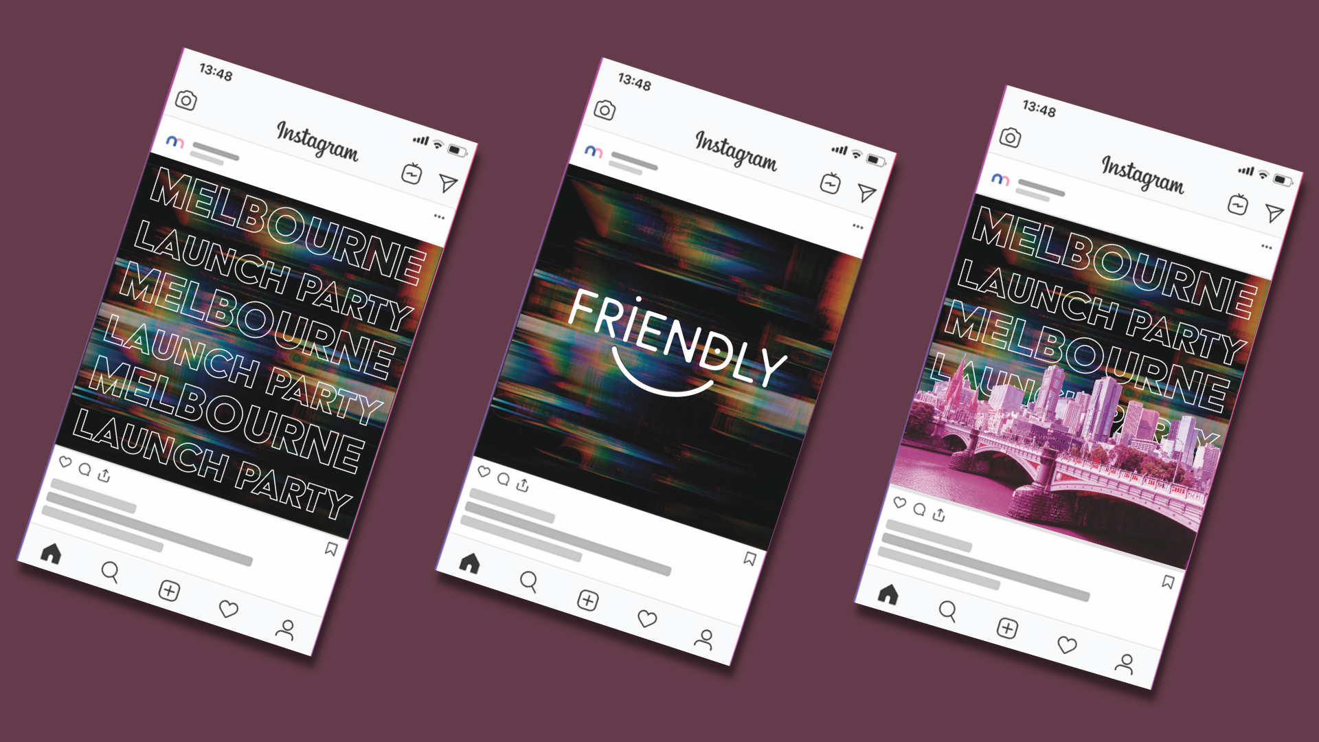
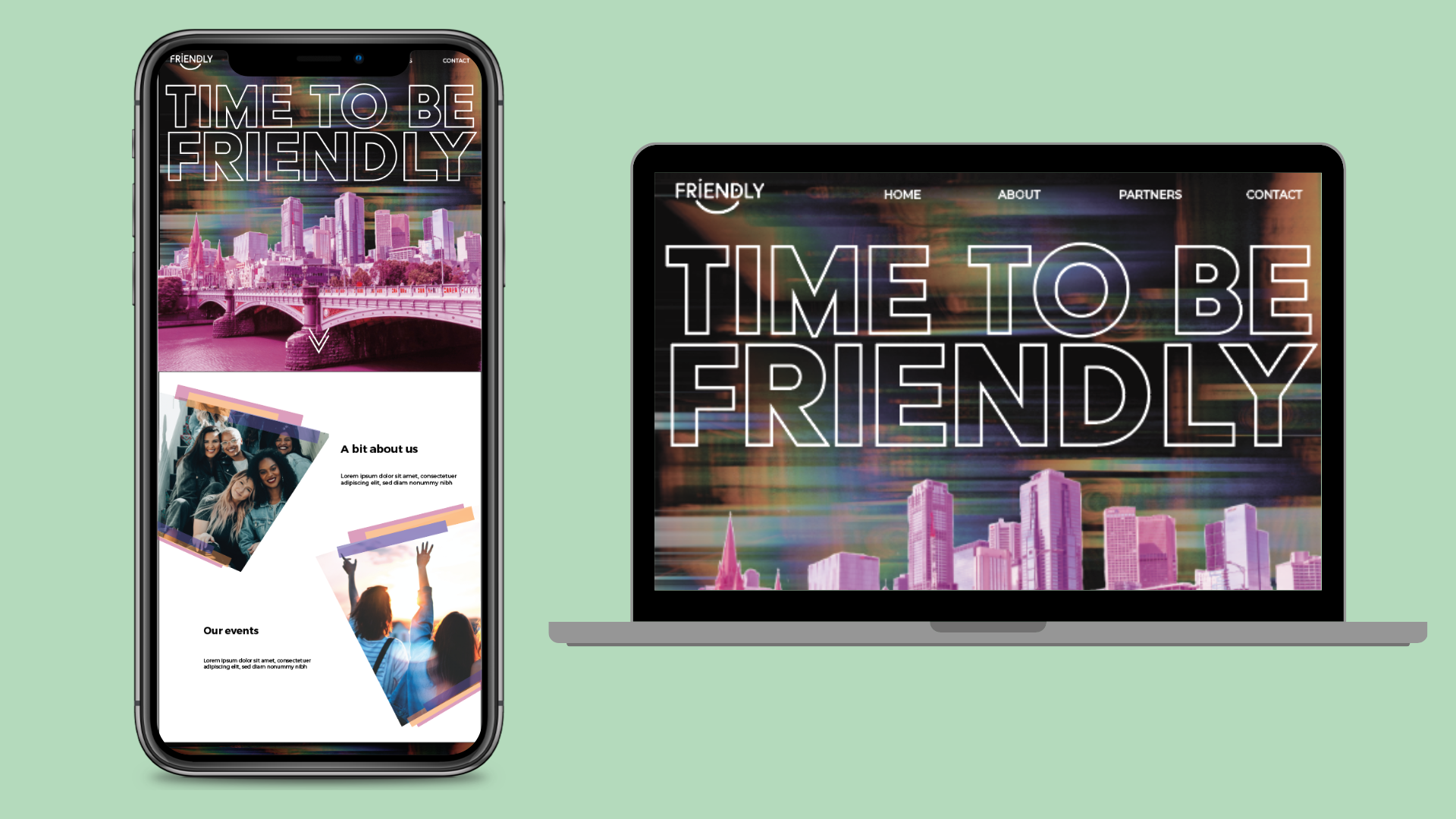
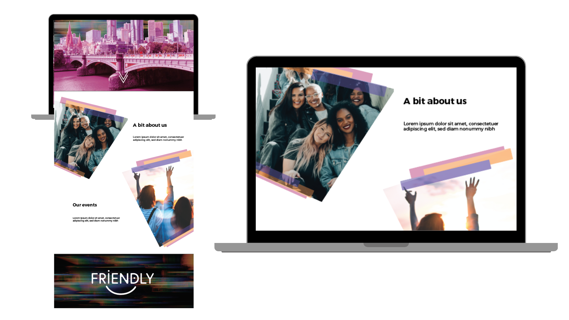
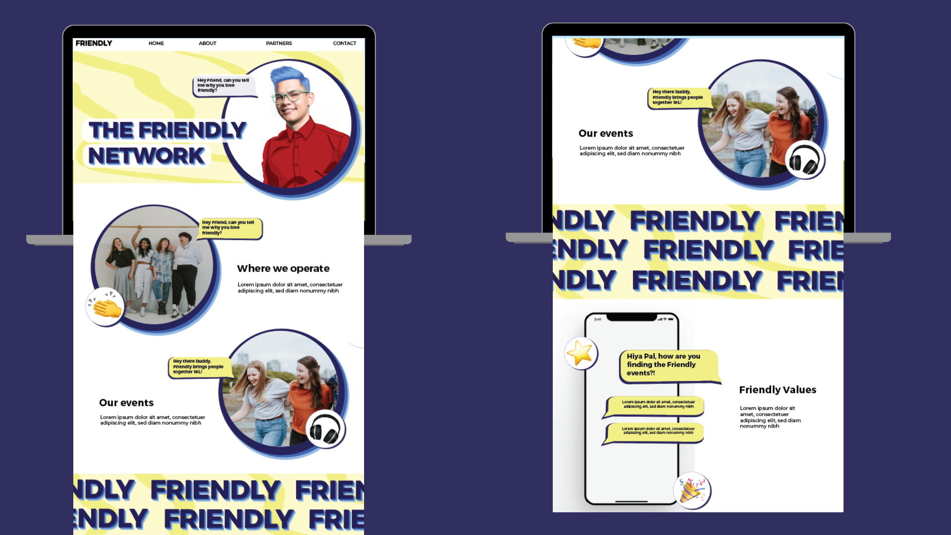
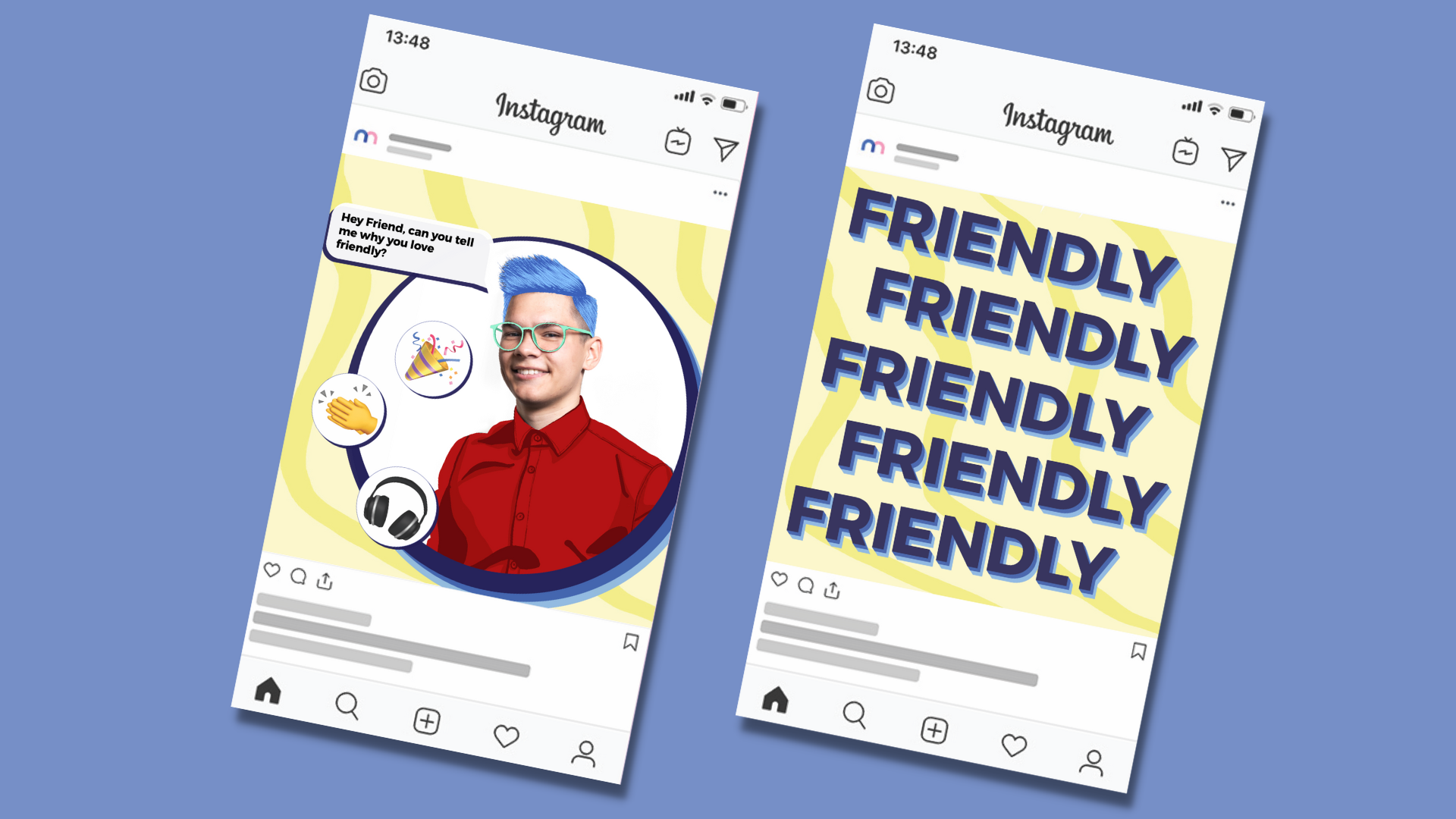
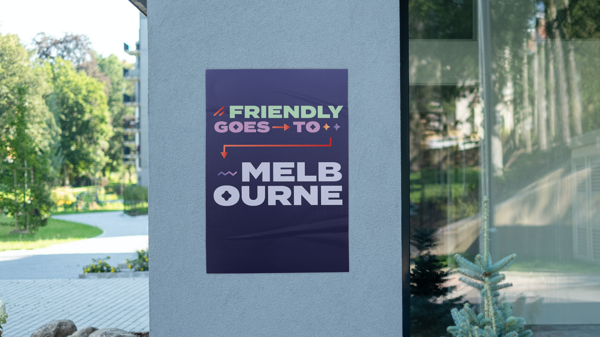
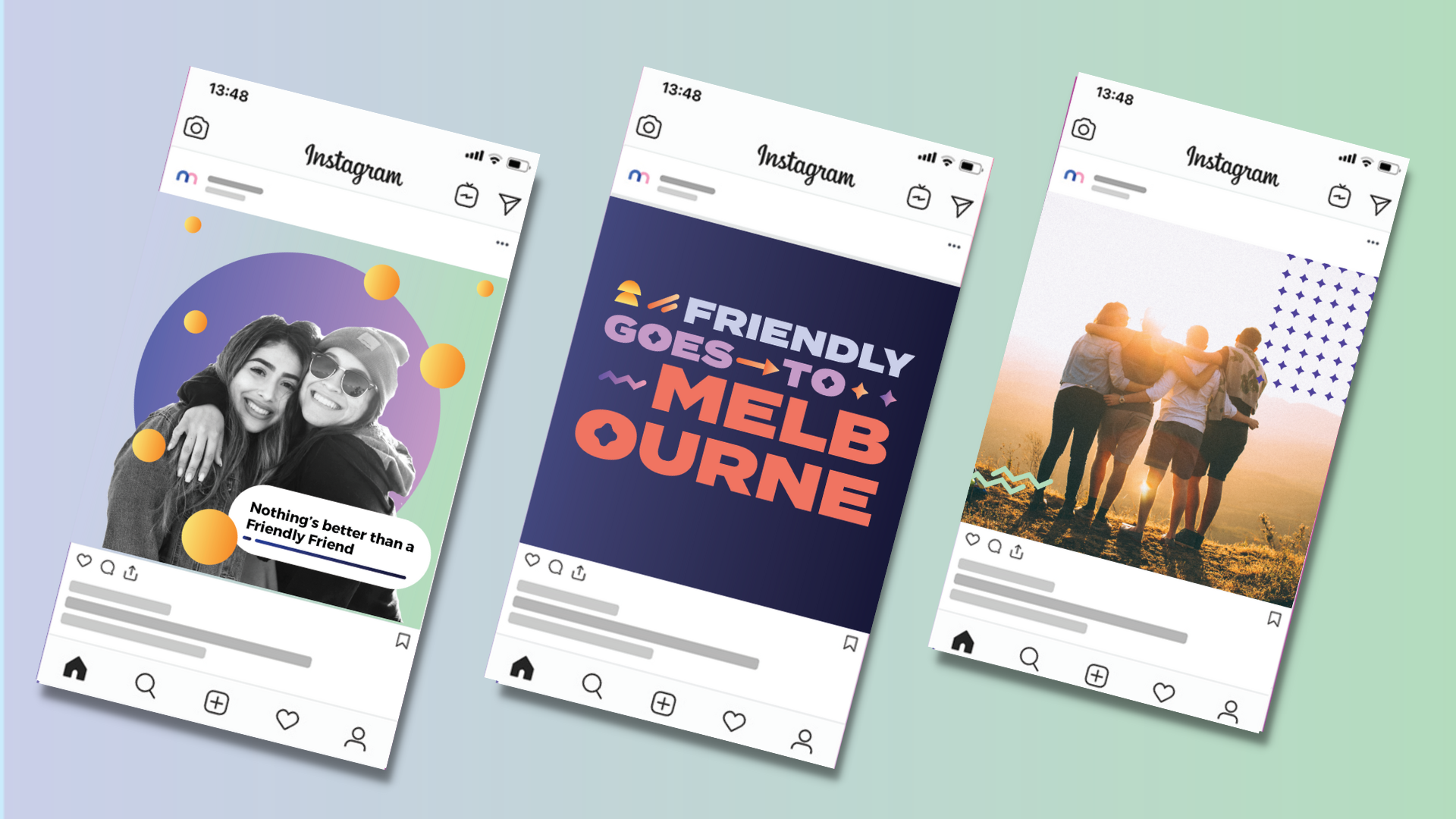
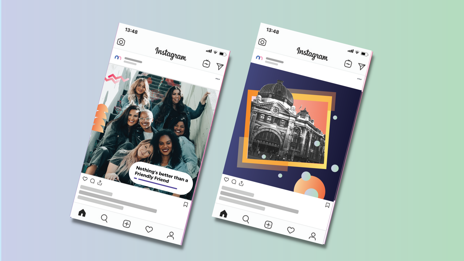
This document encompasses all the research, visual identity, logo rules, tone of voice guidelines and examples of brand execution across print and digital outcomes. This is a large body of work which will be crucial in the development of campaigns and content going forward.
The development of this involved a long strategic process, followed by visual territory exploration and refinement.
The behind the scenes process is detailed below.
THE PROCESS


1: STRATEGY
We started by looking at the brand strategy and doing an environmental analysis considering competitors and what the consumer needs from the app. From here, we developed the customer value proposition, audience segmentation and targeting. We also looked at ways of reinforcing the brand in the market.
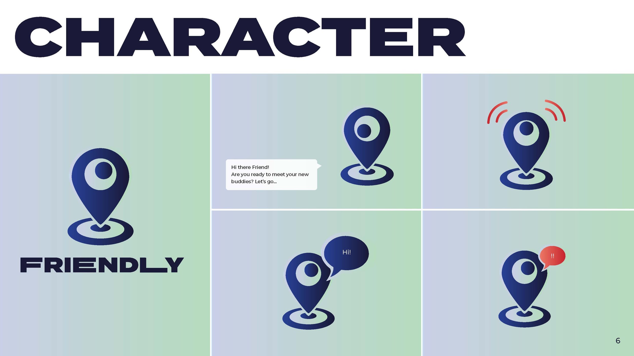
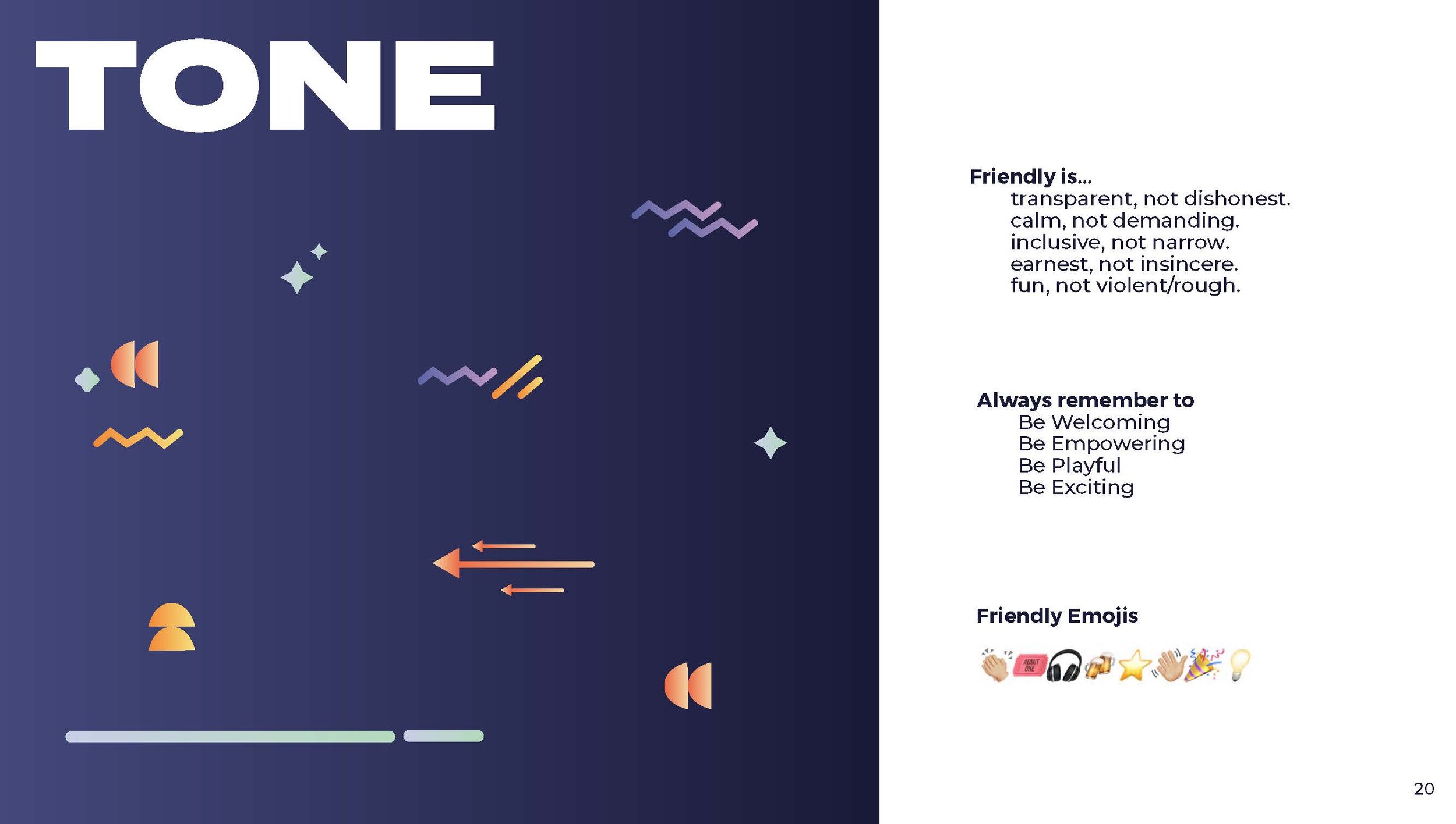
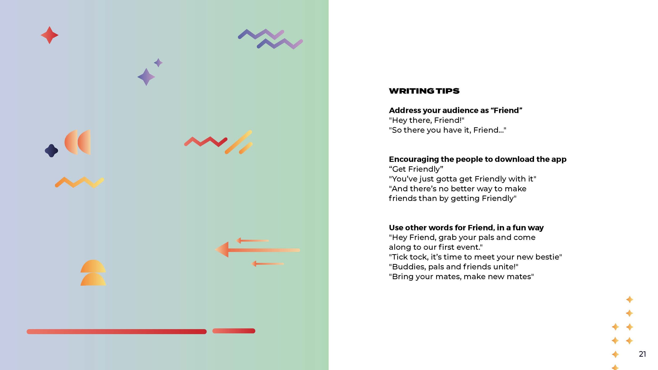
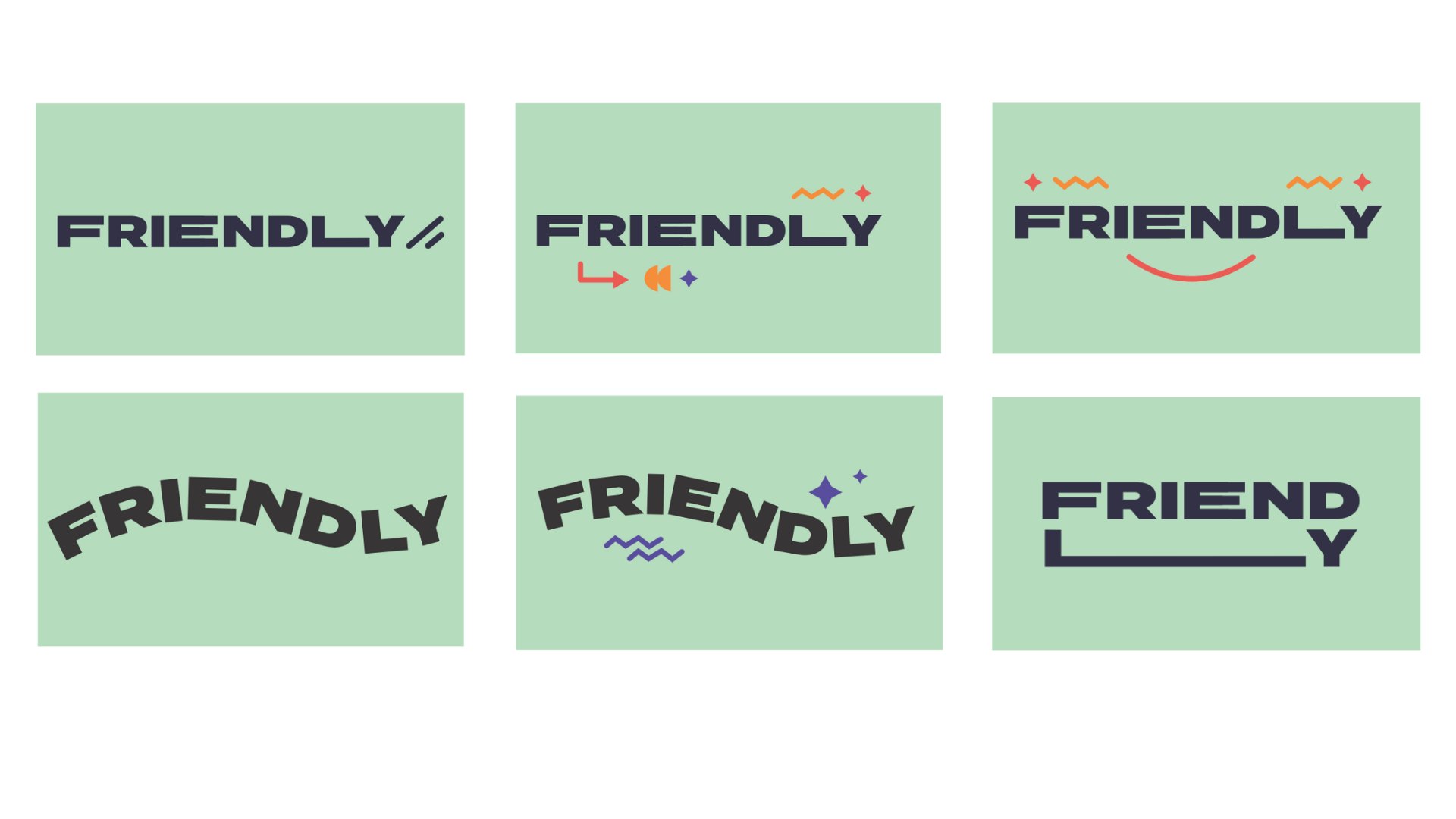
Our next step bridged the strategic work with the creative to follow by working through the Friendly tone of voice. This explored the tone, brand persona, terms and phrases that we use and even which emojis represent us. This will aid Friendly in their content creation going forward.
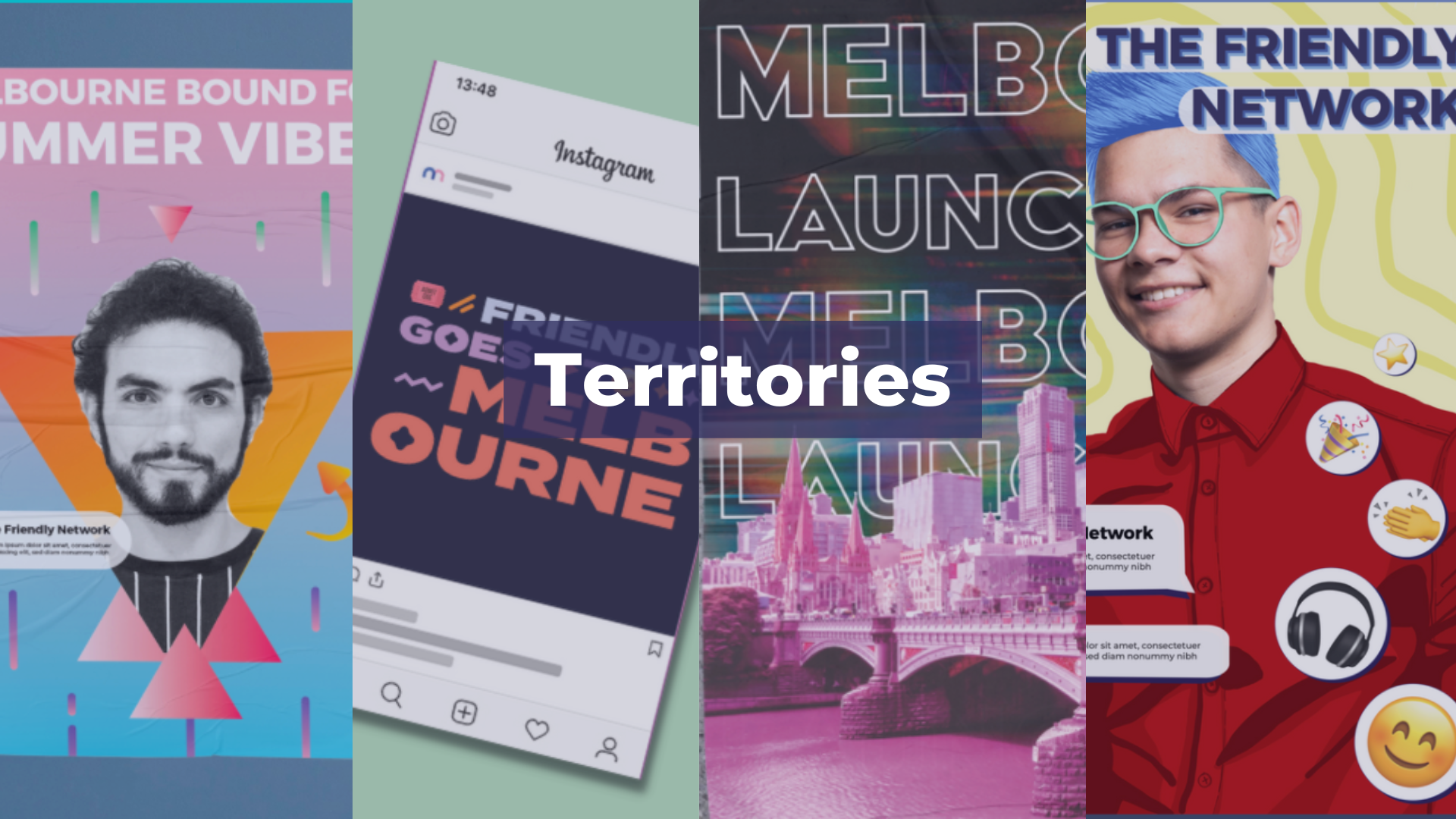
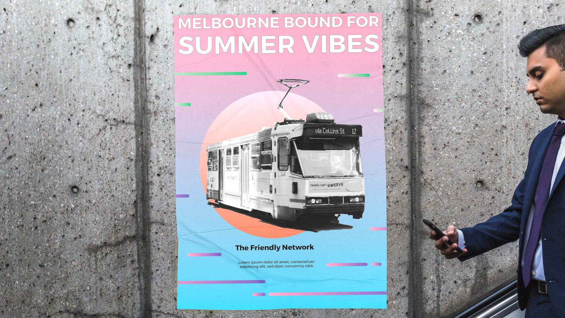
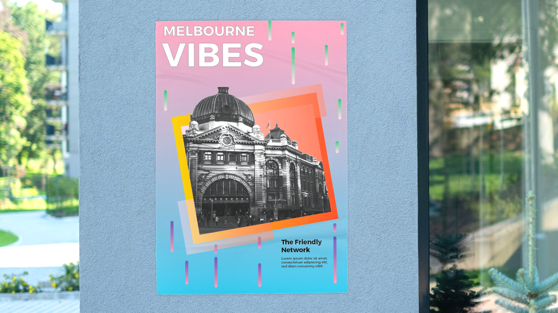
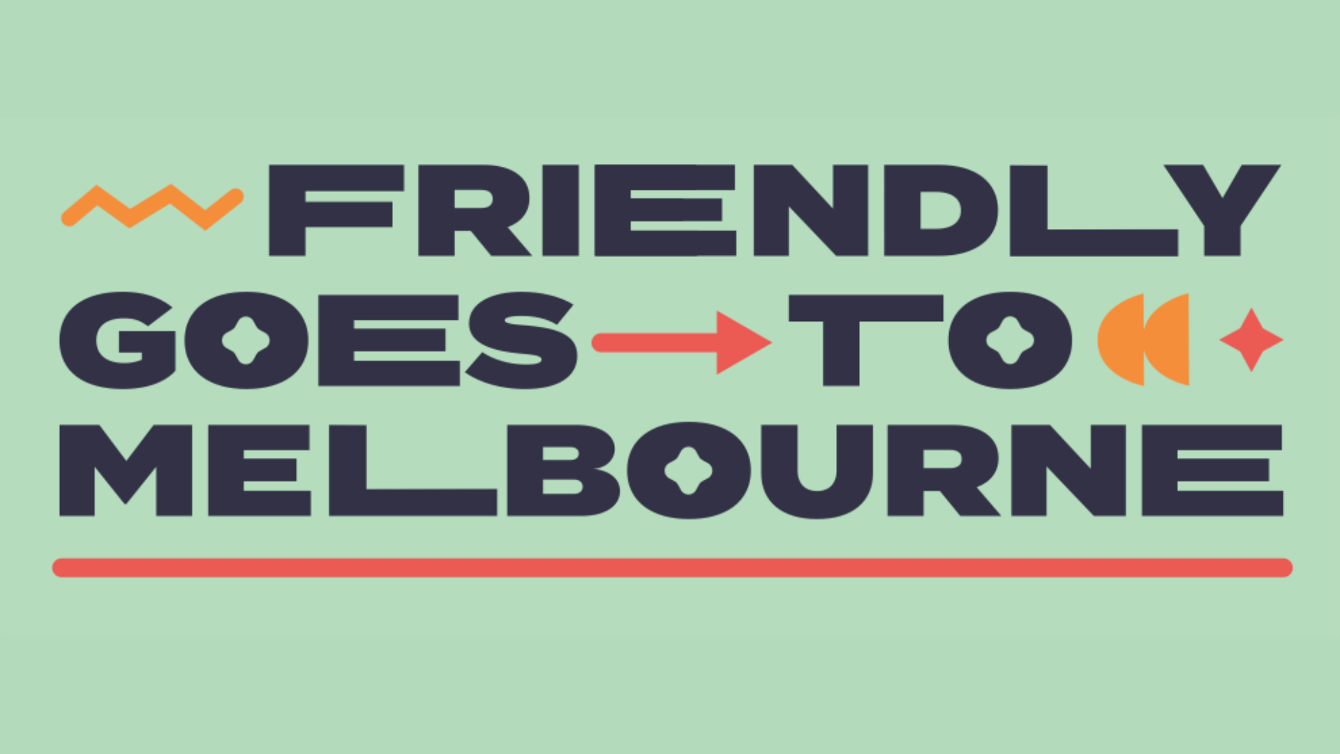
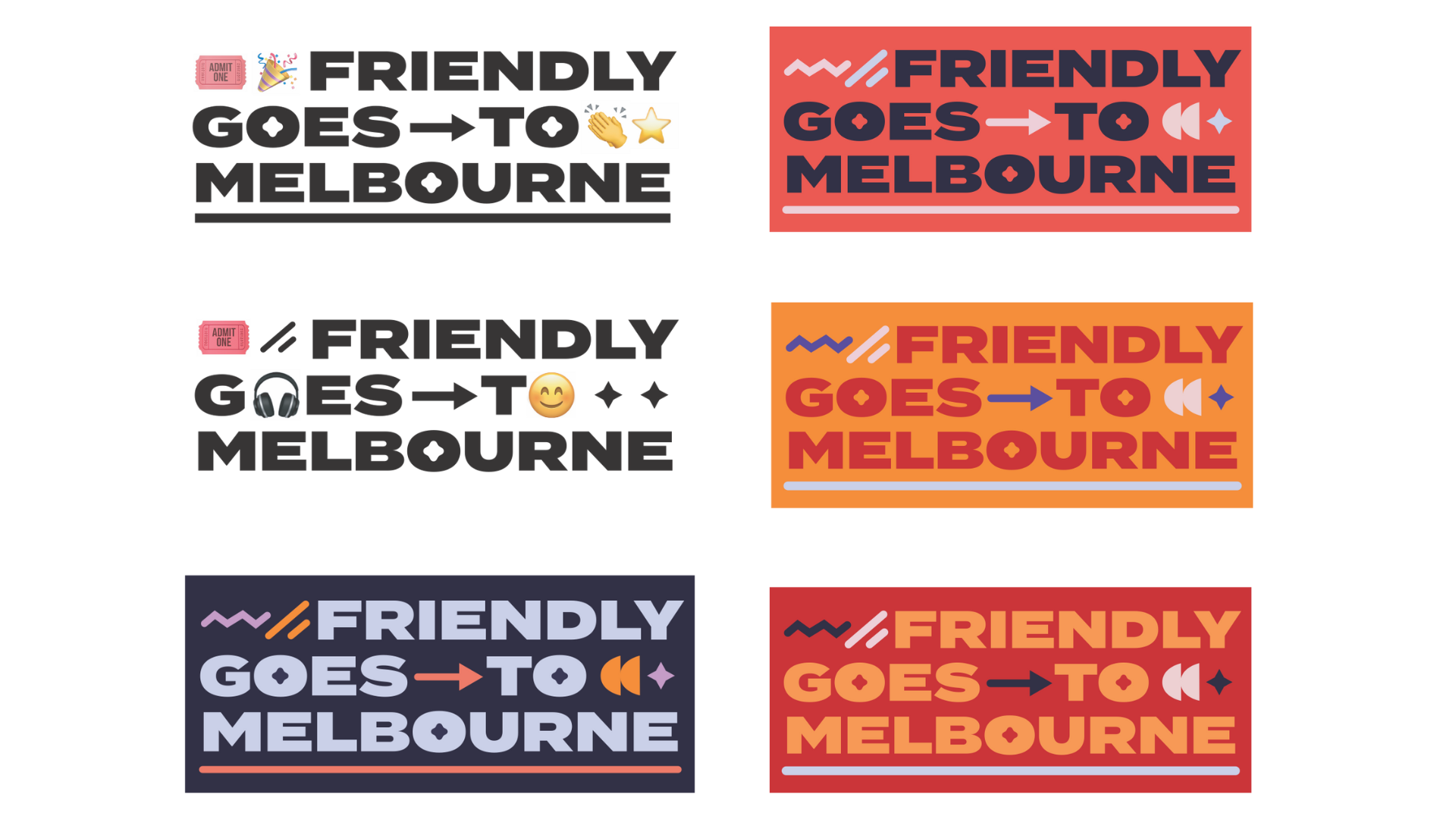
2: TERRITORY EXPLORATION
This was the first time we explored any visual representation of the Friendly brand.
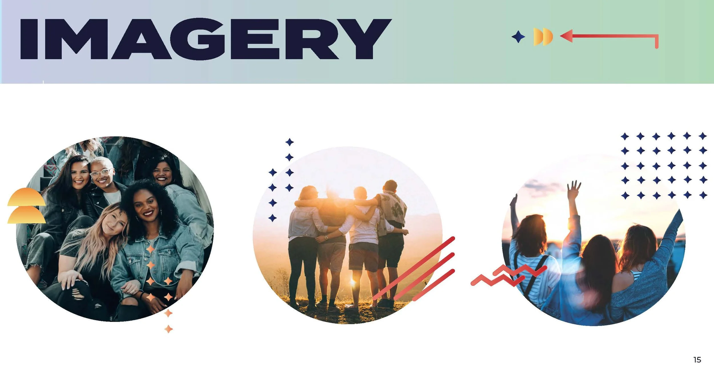
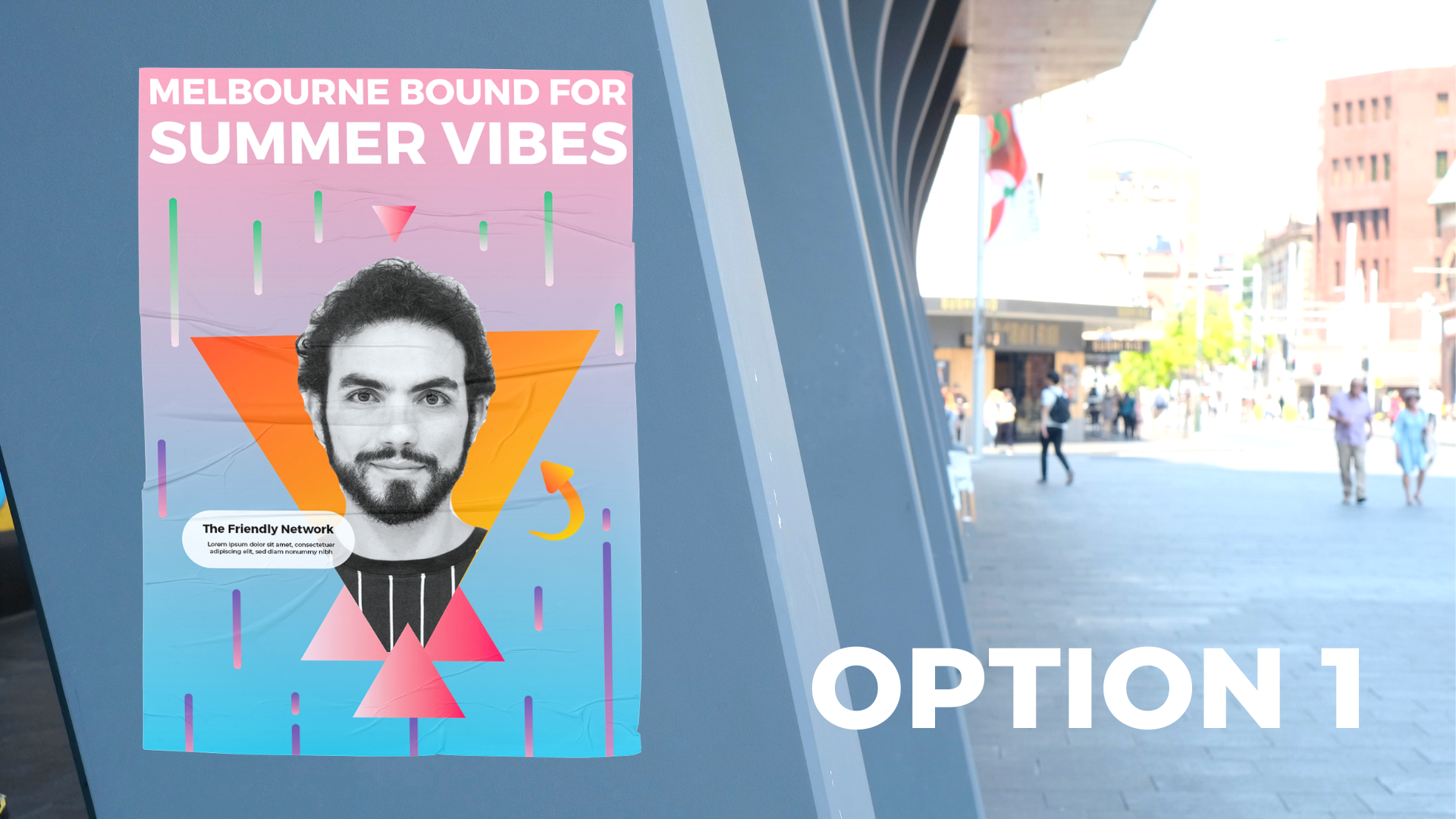
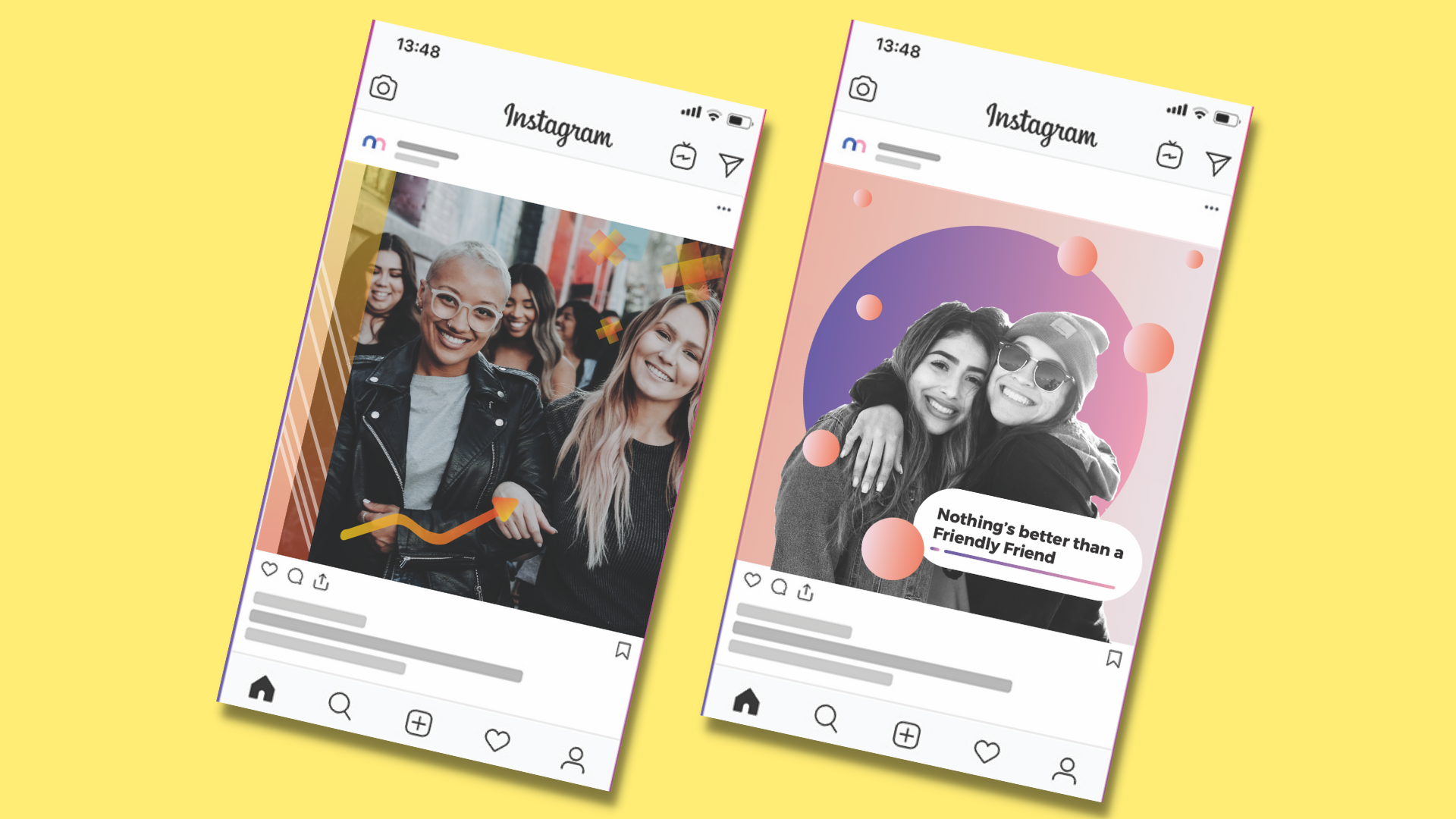
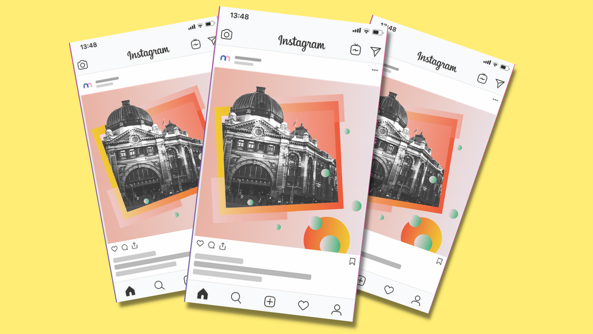
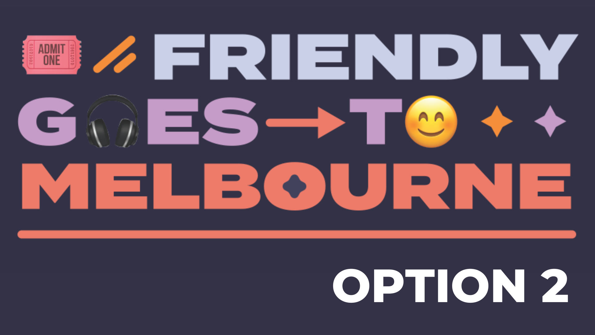
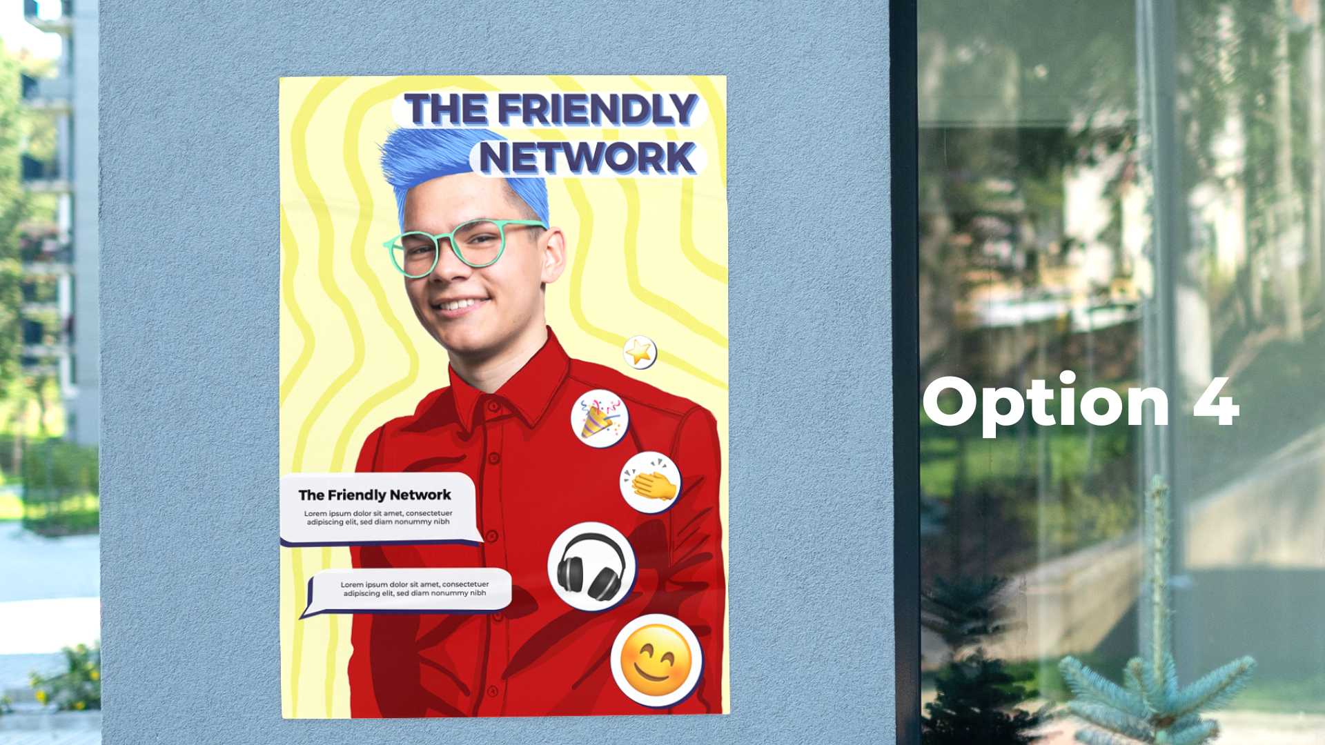
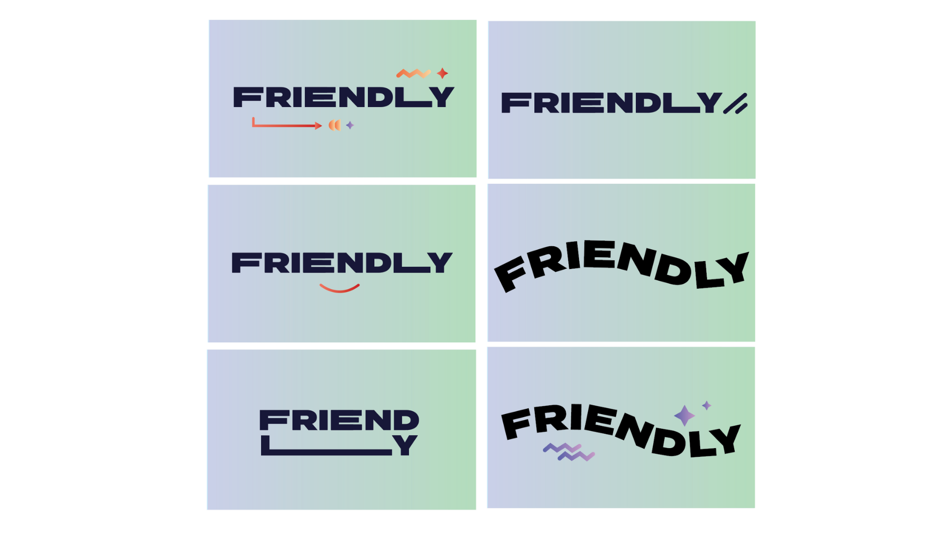
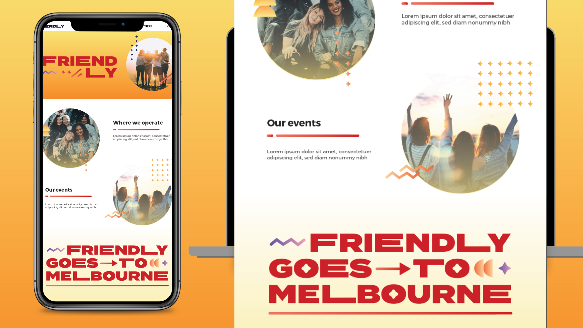
Leaning on the brand strategy and tone of voice document, we put together 4 different options for the Friendly team to review. Each option showed completely different logos, treatments and how they may look across digital and/ or print outcomes. Techniques for each territory differed, from illustration to typesetting, image manipulation and gradient adjustment, there was a range of directions this brand could take.
From here, it was over to the Friendly team to select their preferred option for refinement.
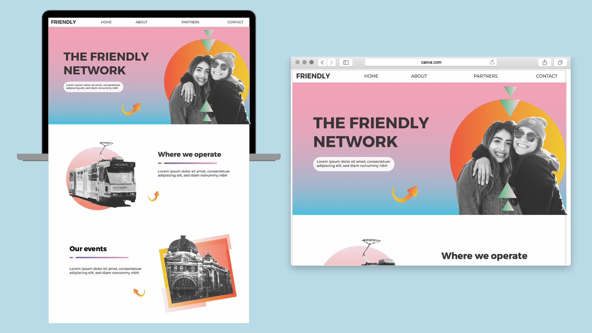
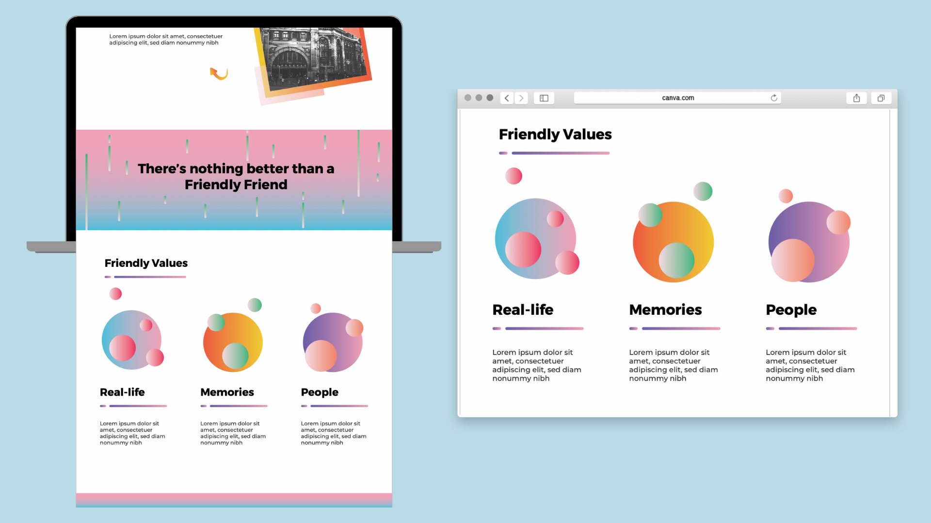
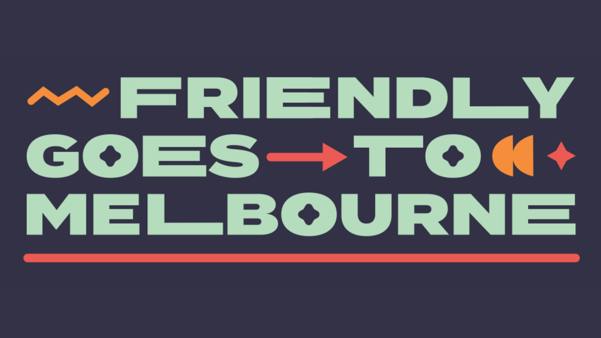
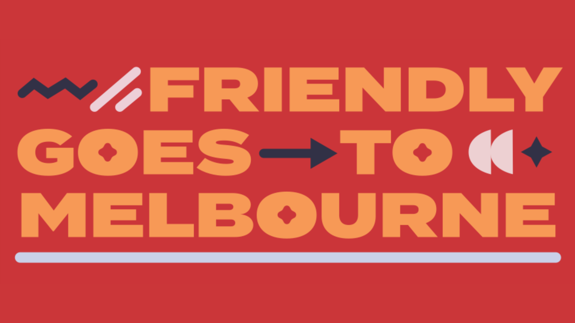
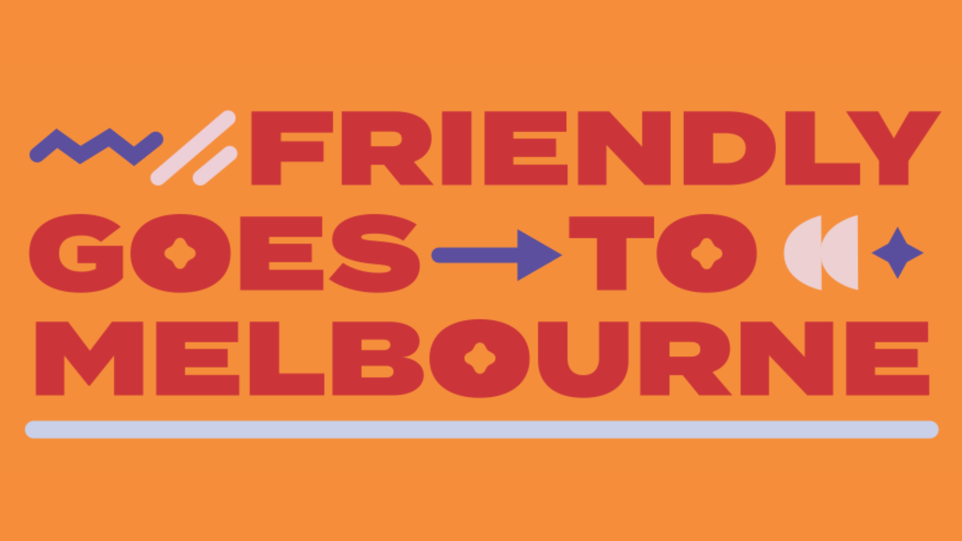
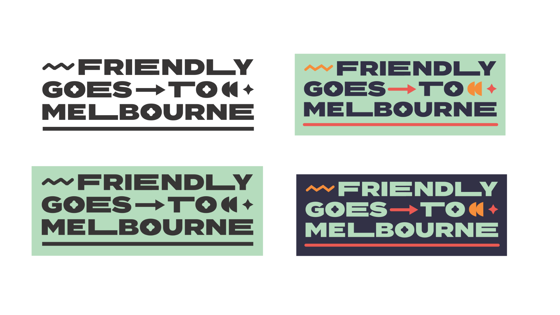
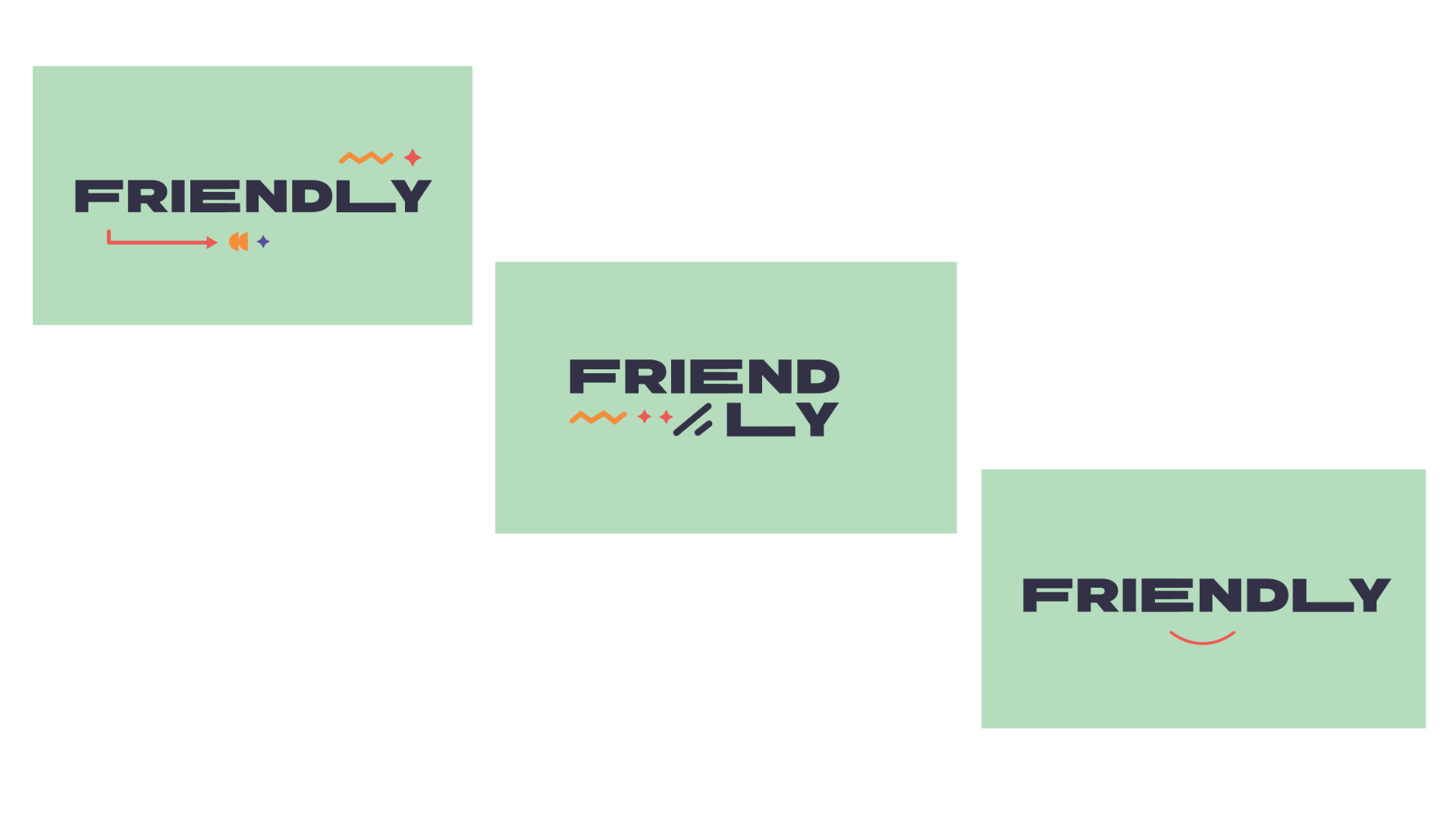


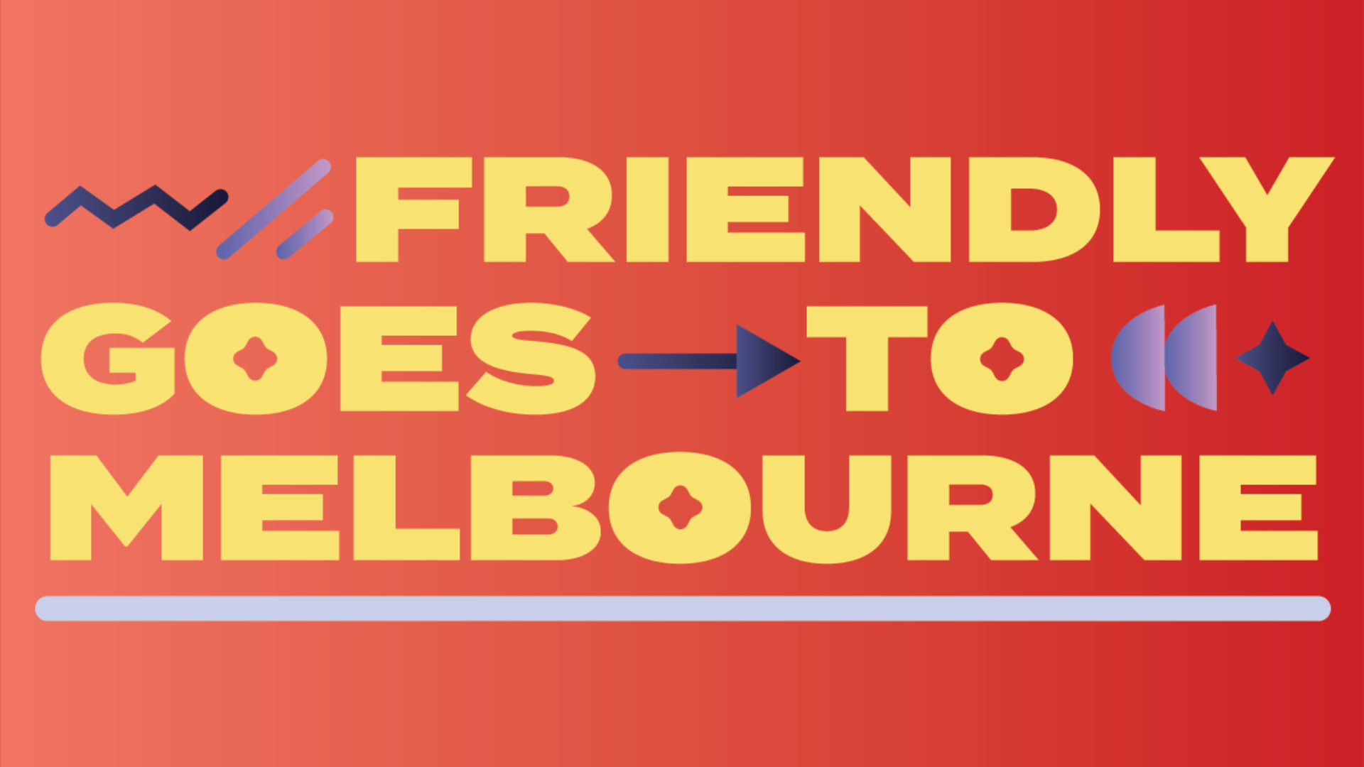
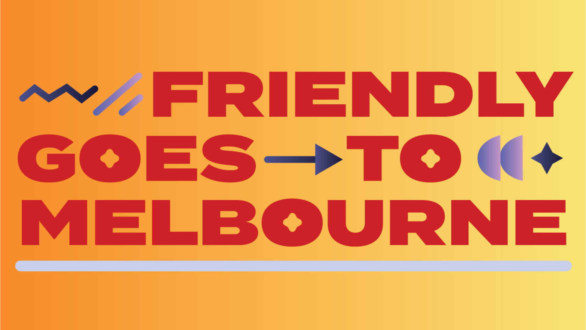
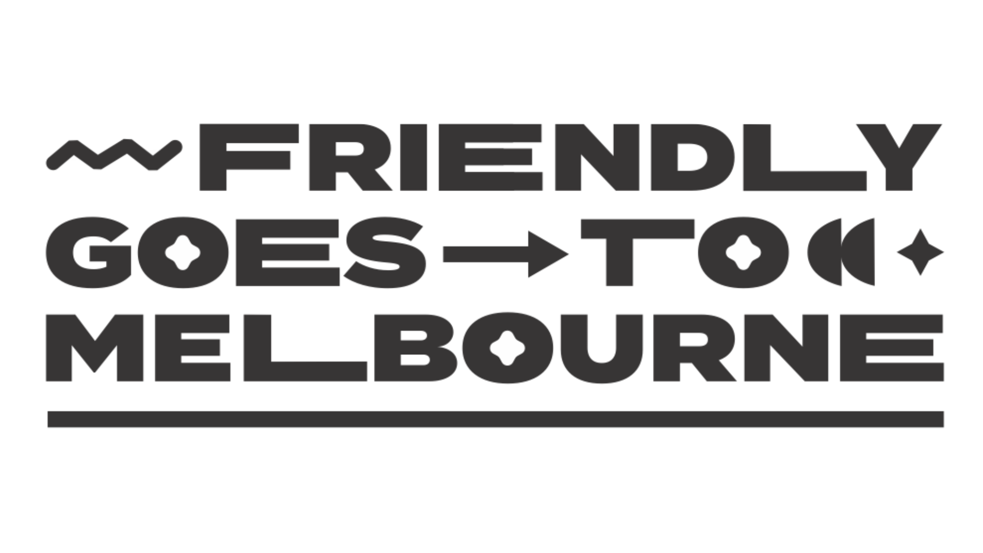


3: TERRITORY REFINEMENT
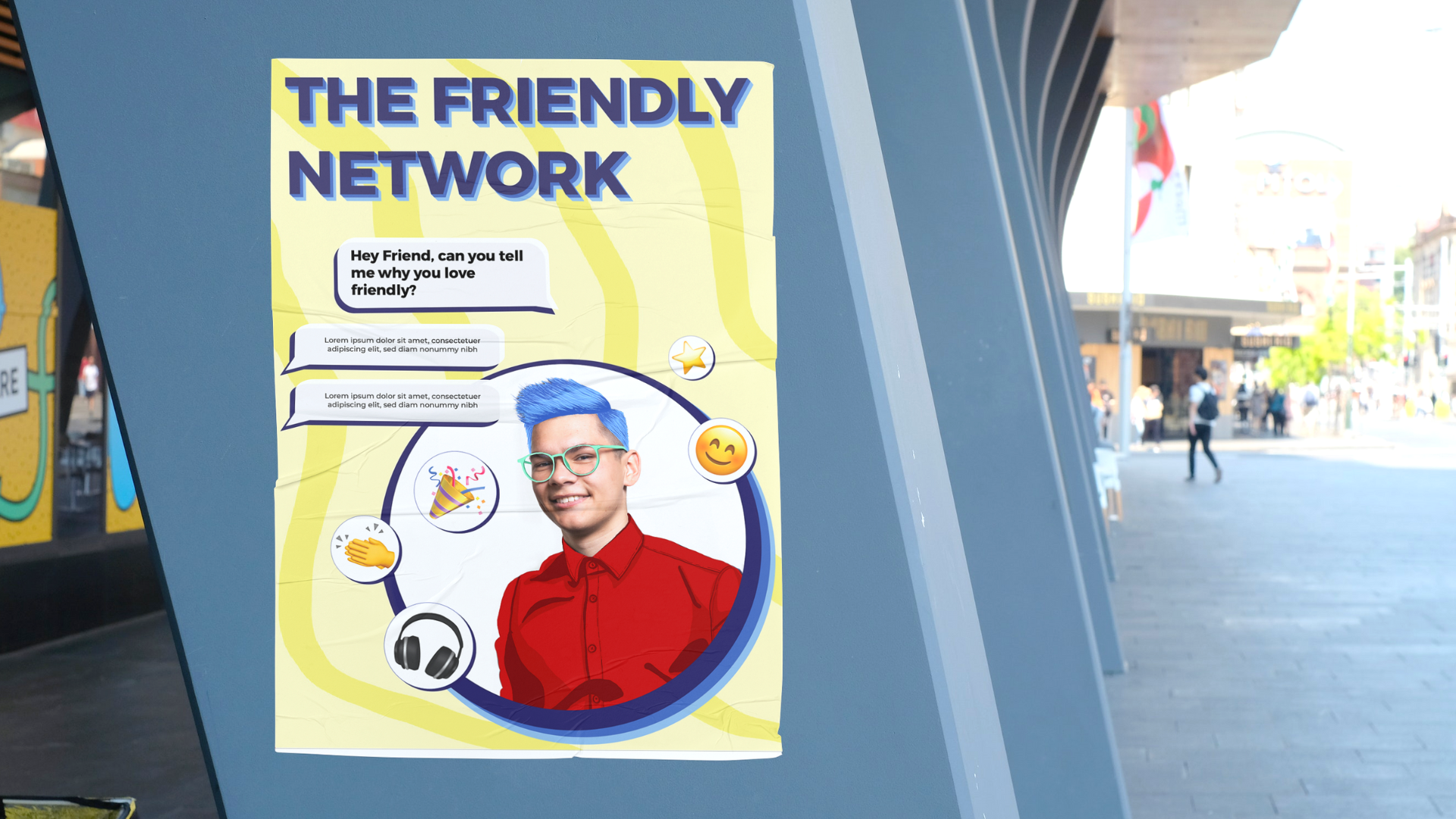
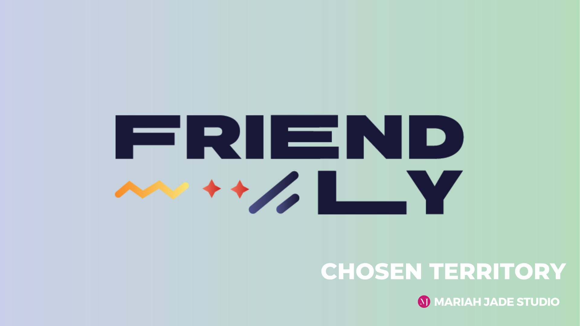
The Friendly team selected option 3 and from here, we moved into refinement and actioning of feedback.
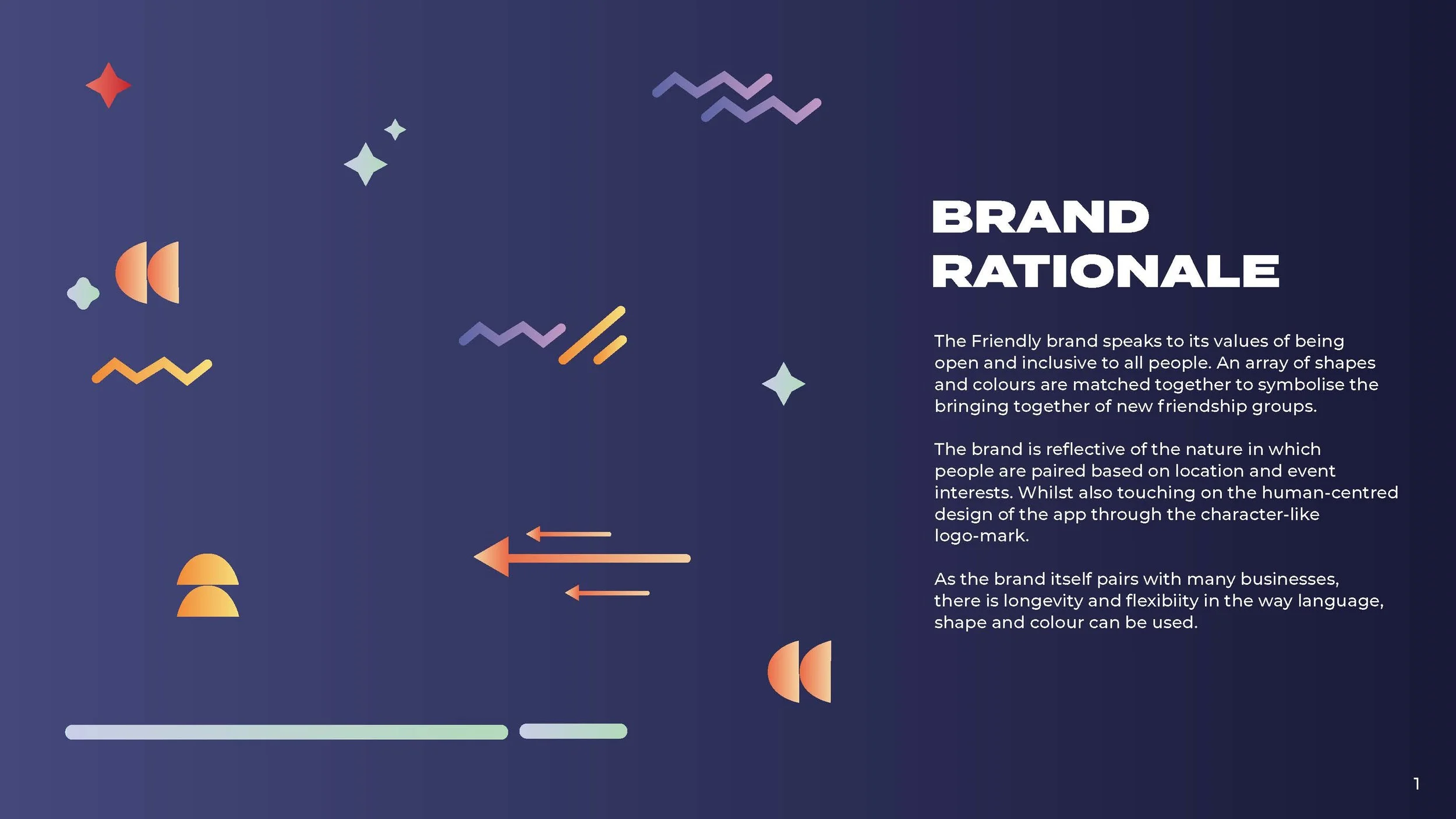
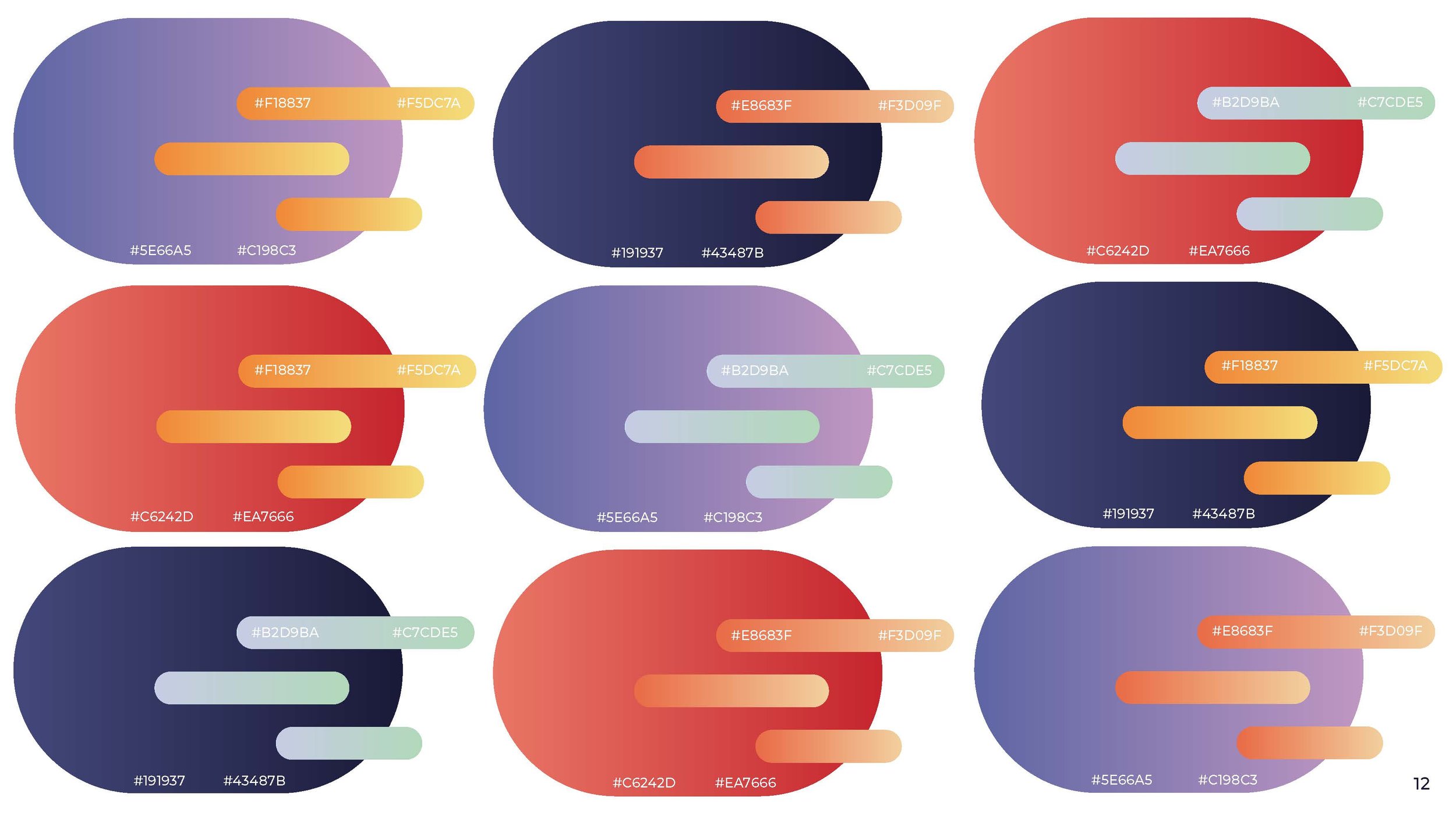
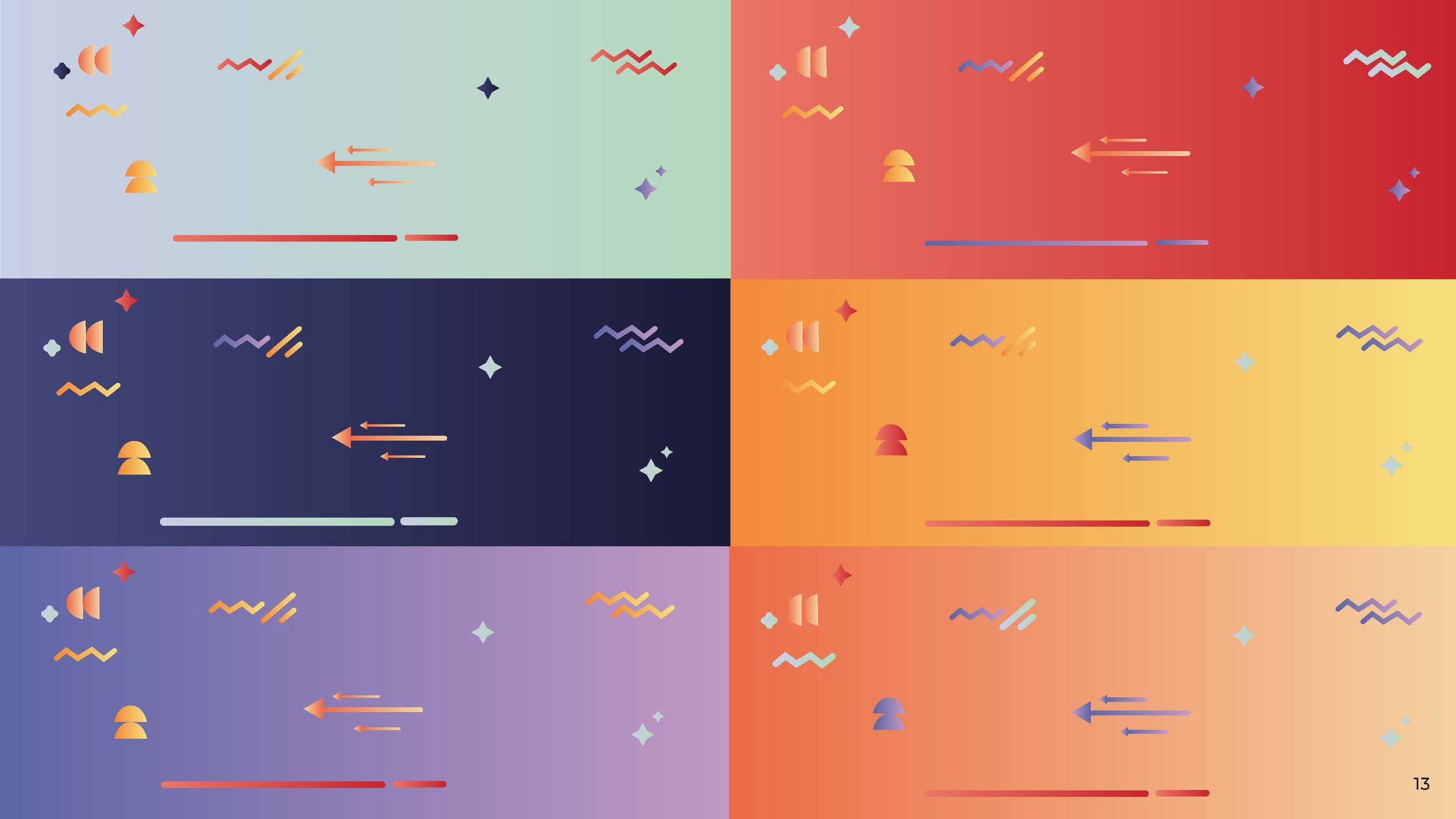
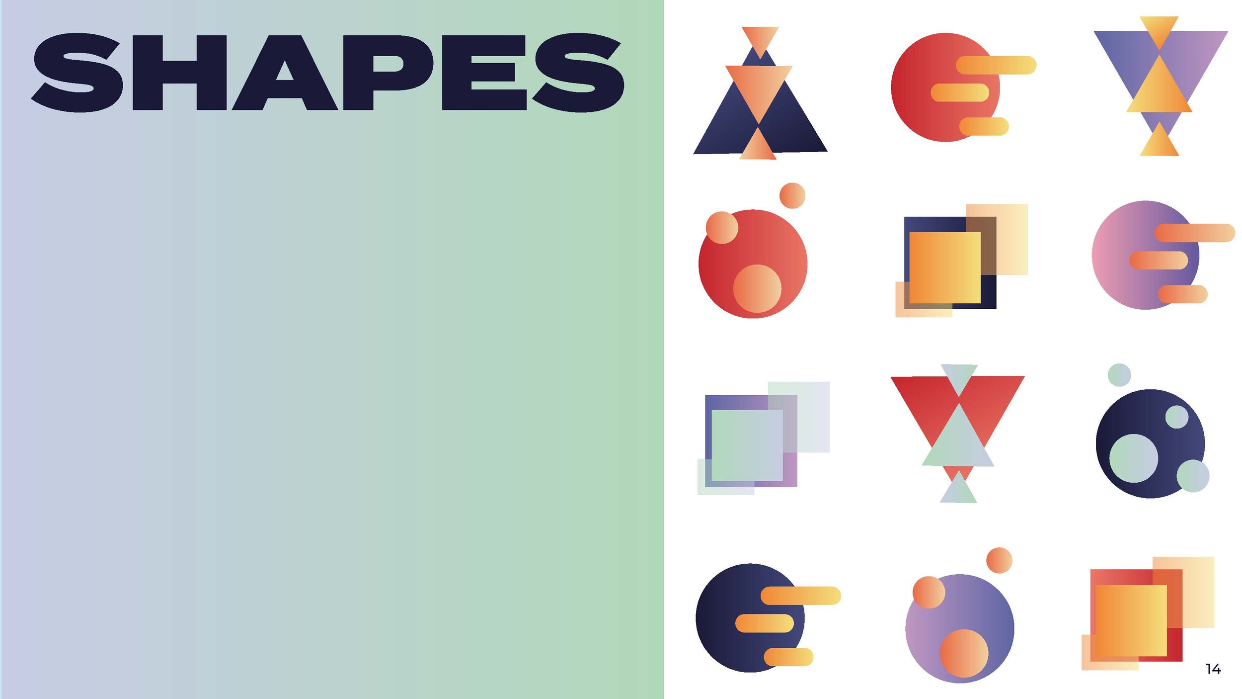
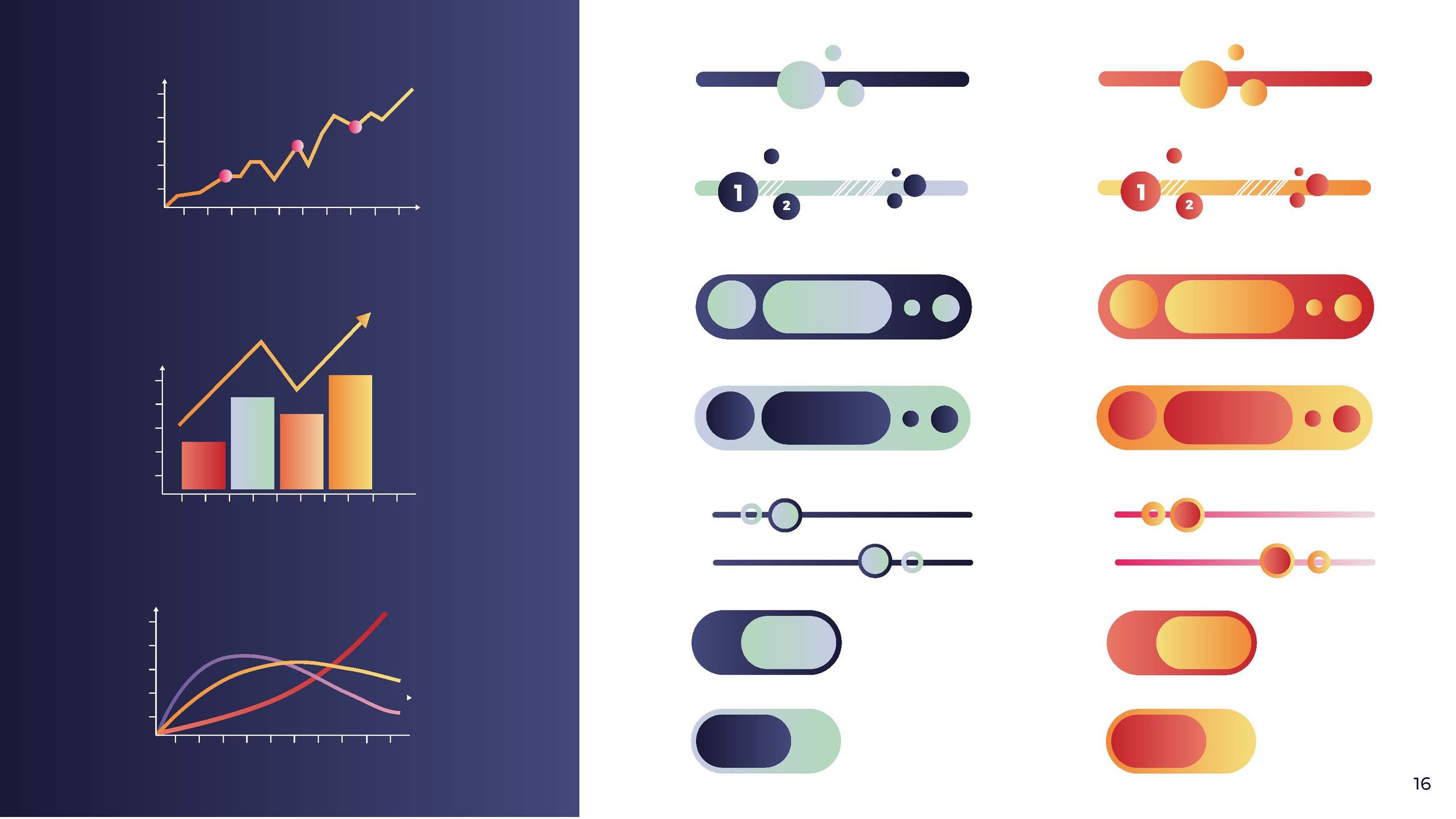
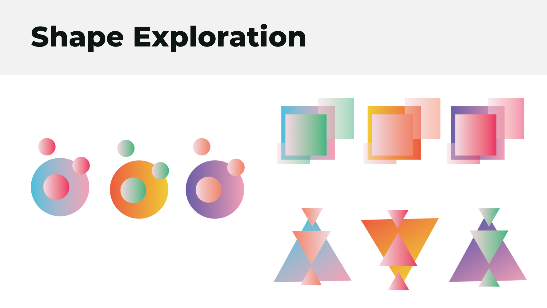
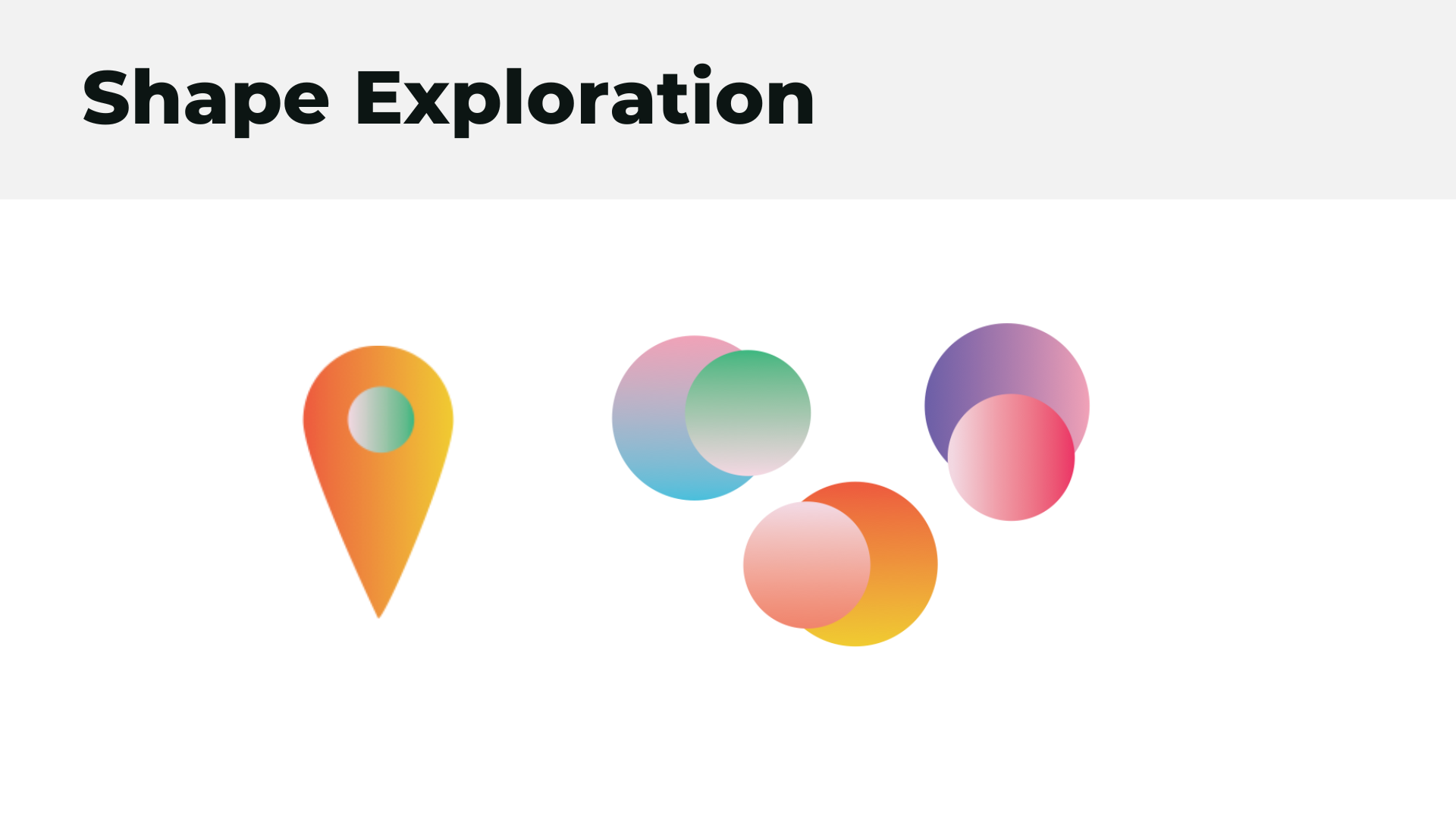
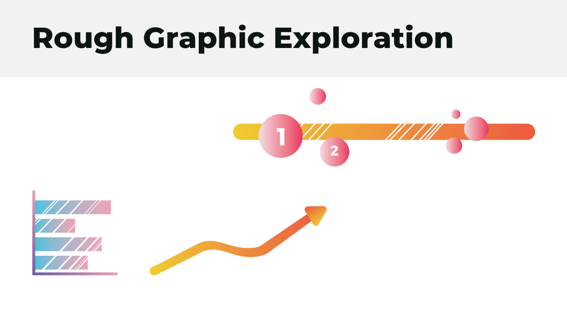
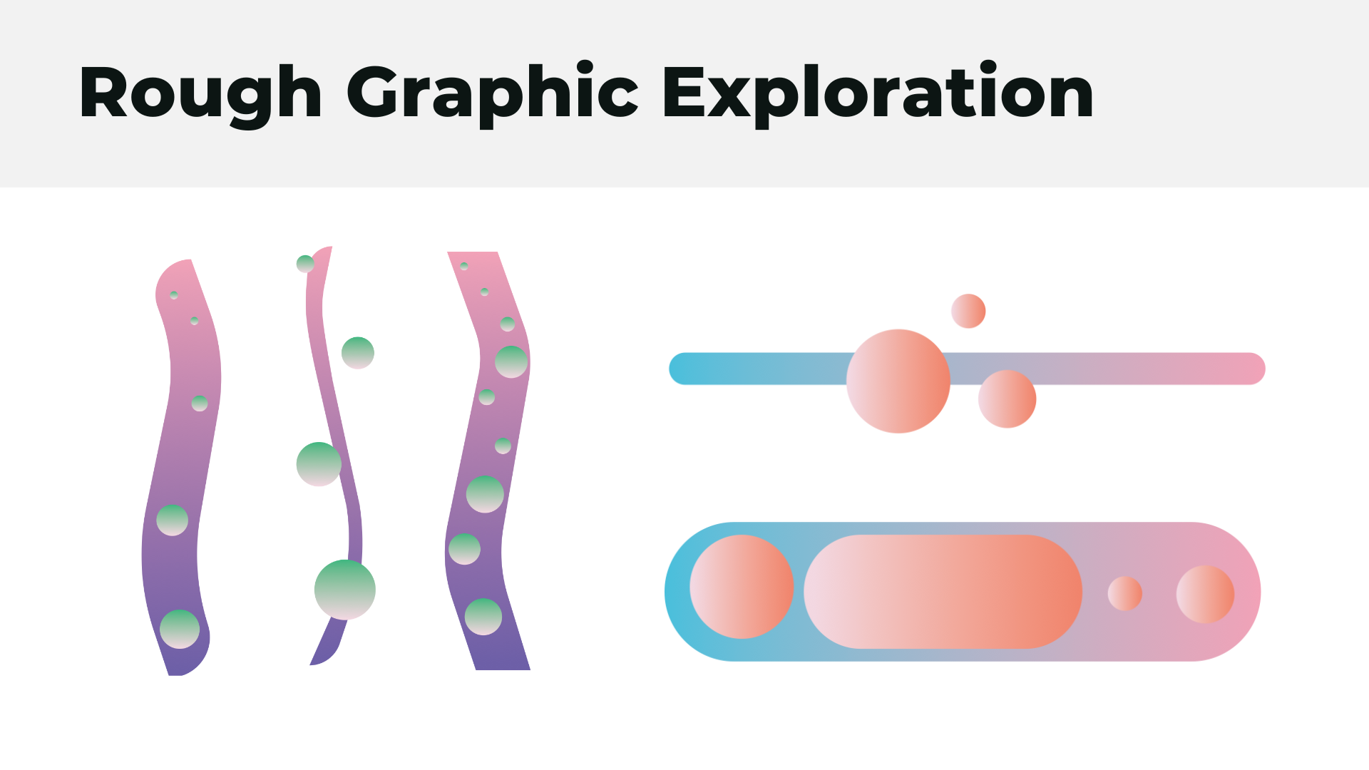
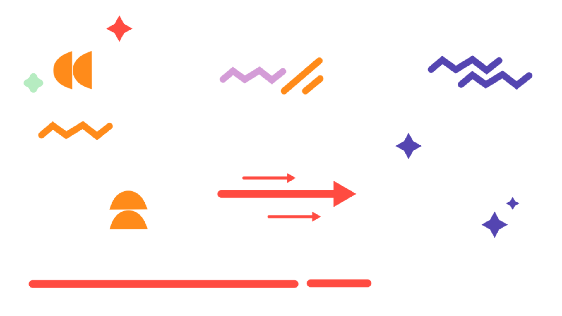
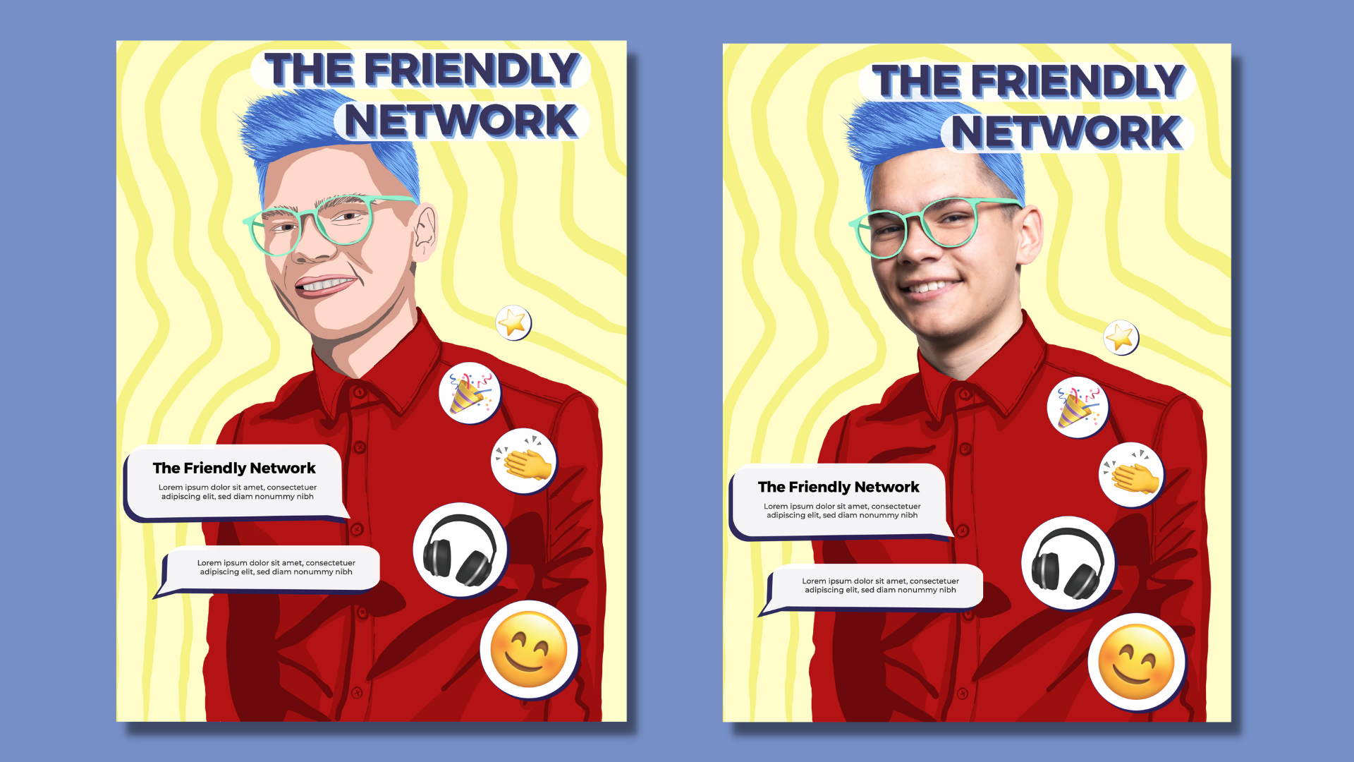
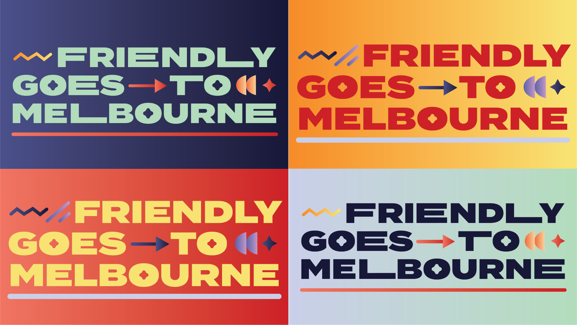
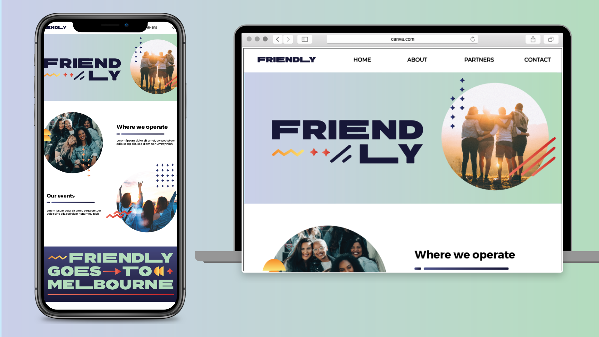
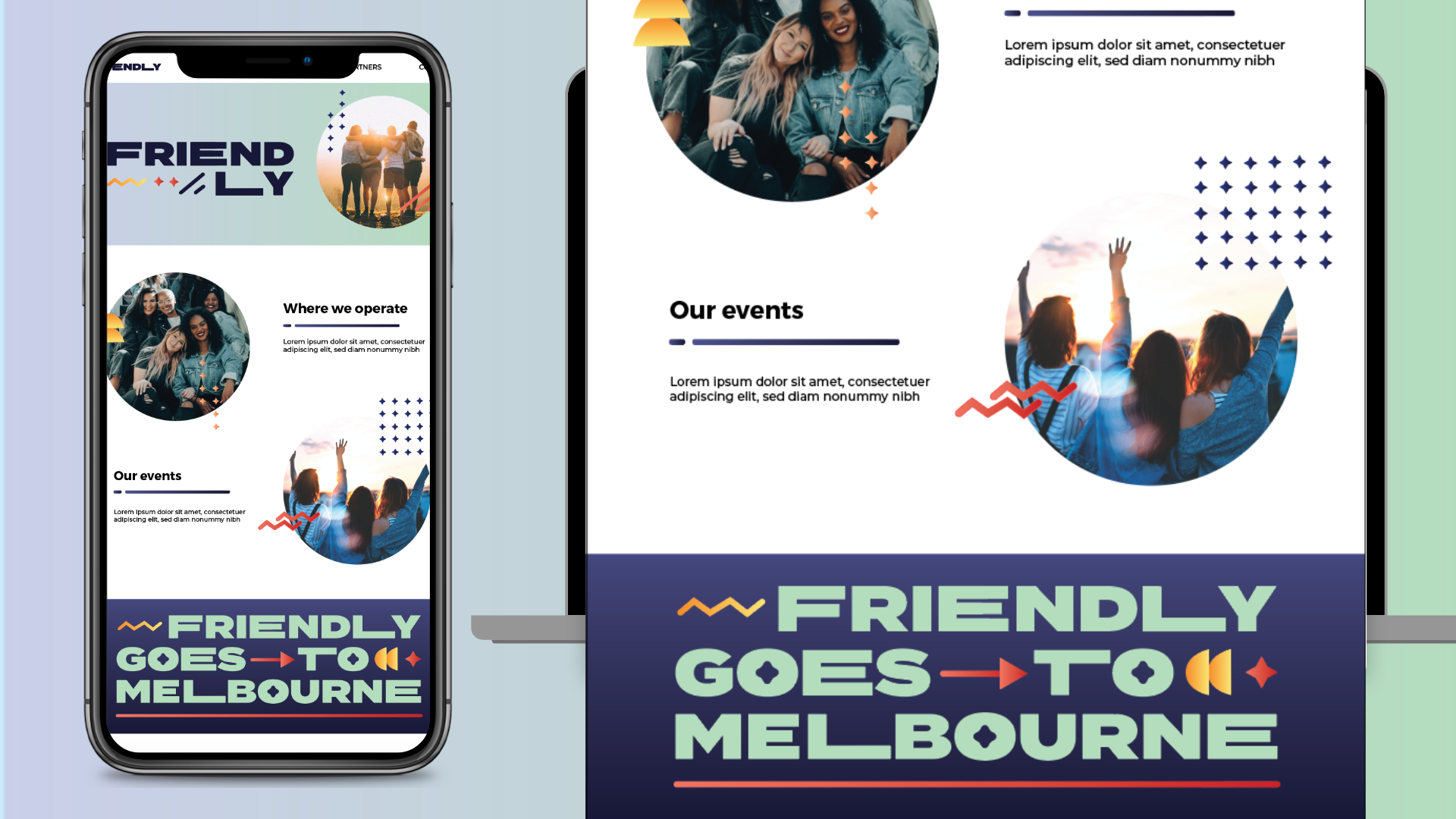
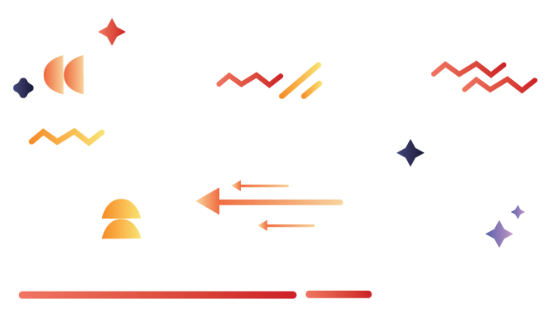
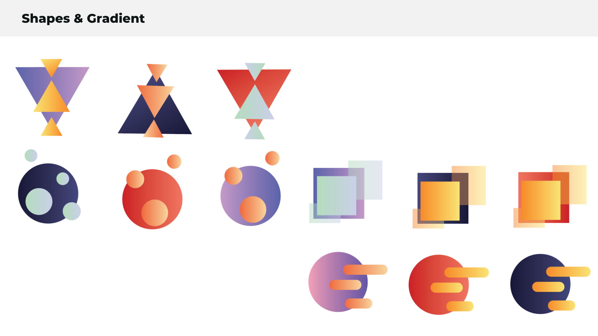
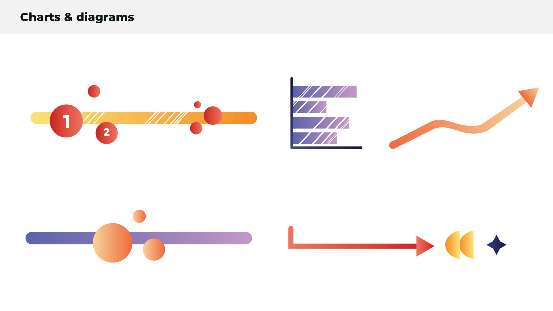
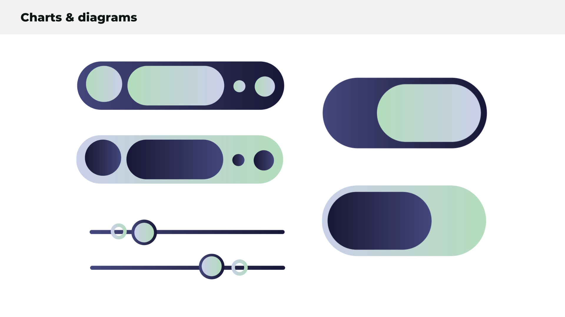
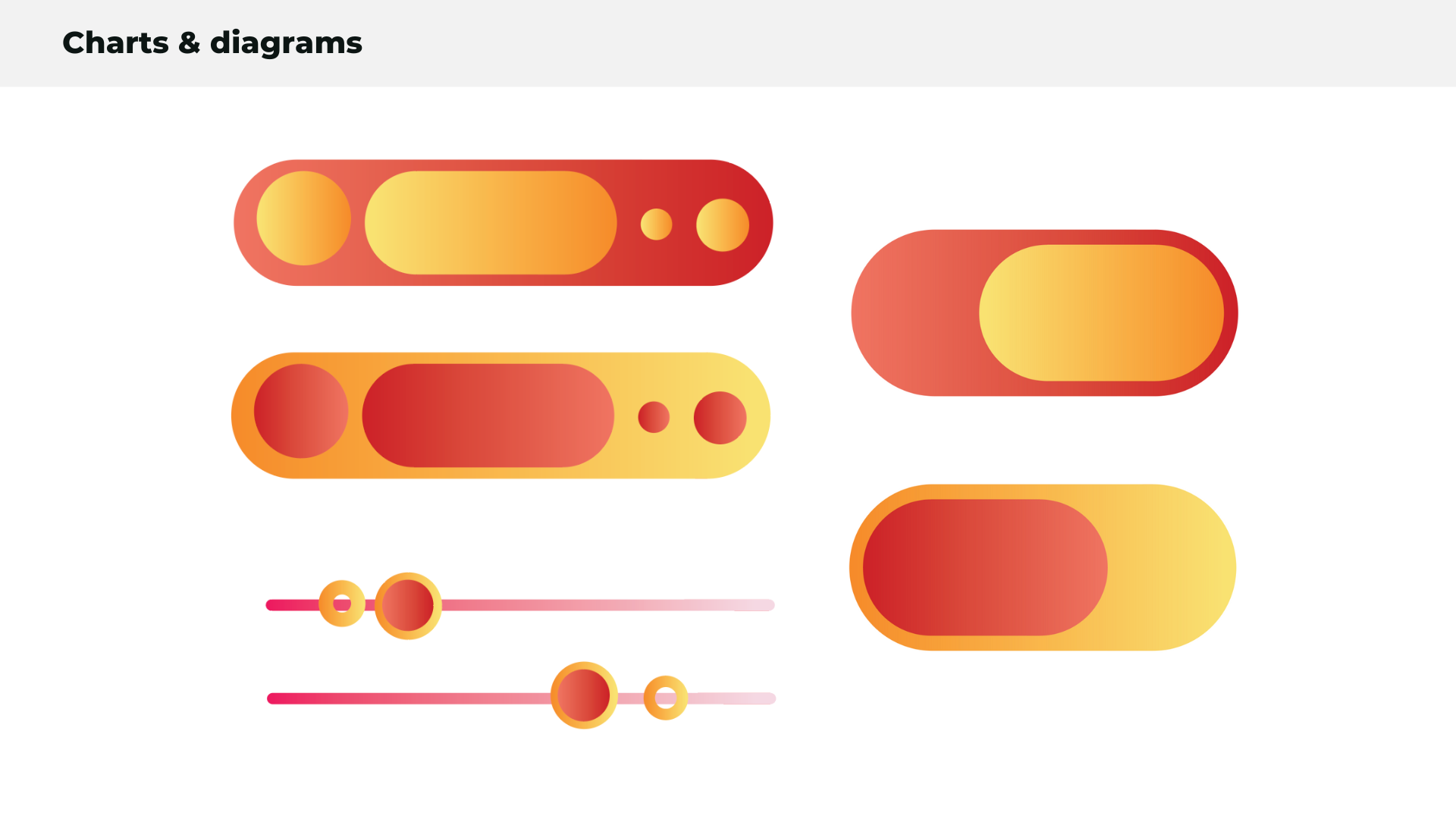
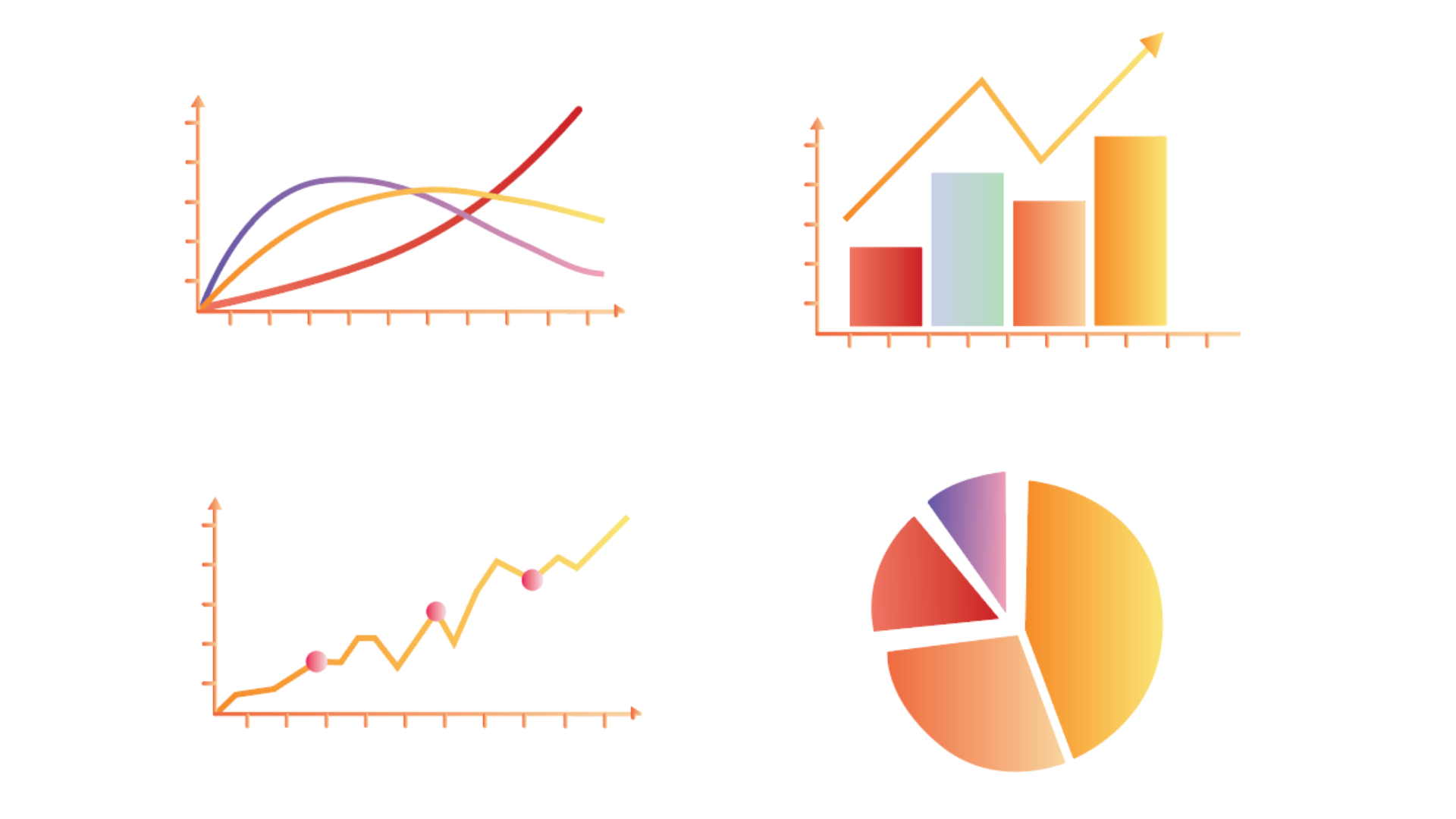
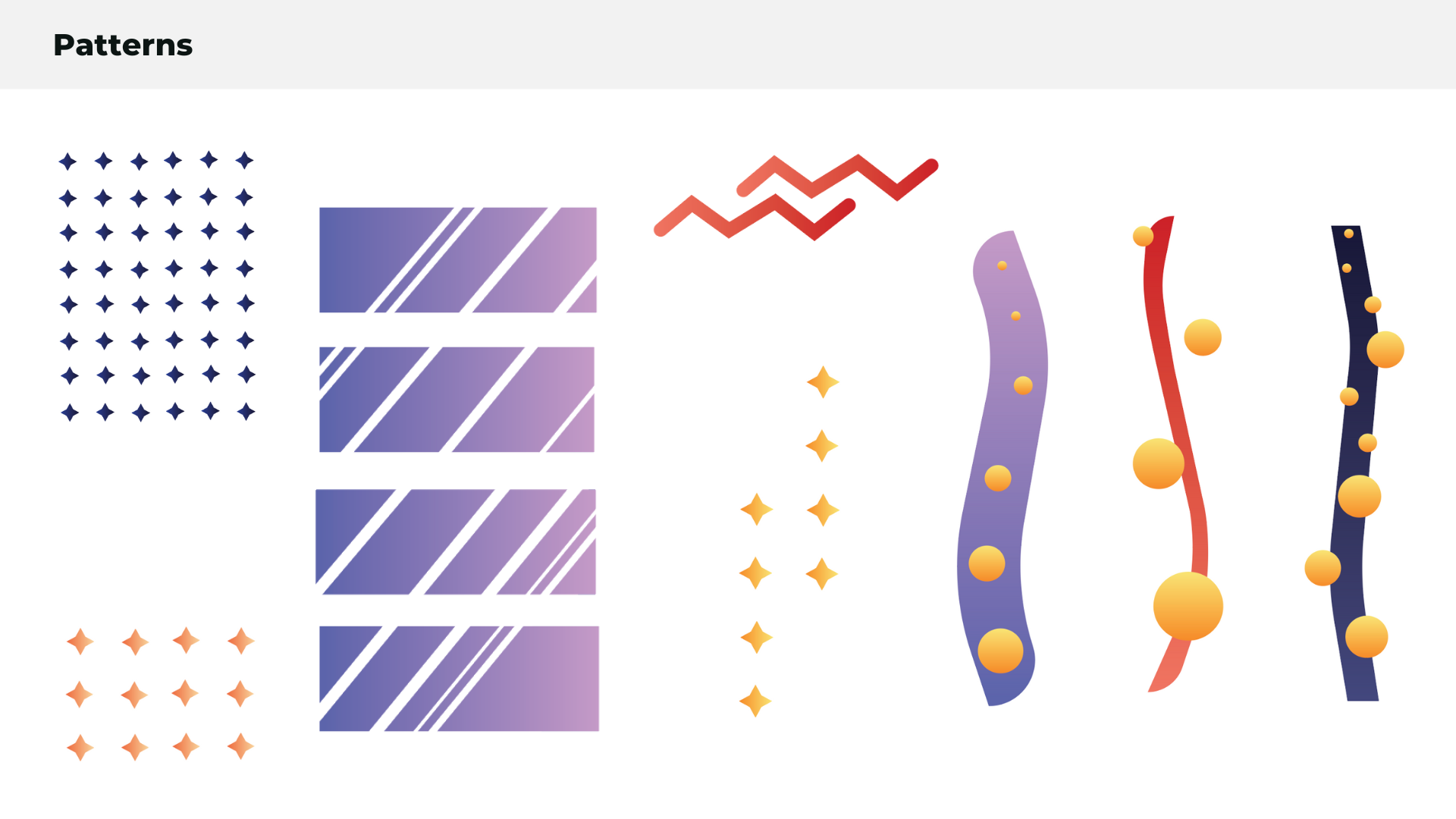
Although option 3 was chosen with a stronger emphasis on type setting, the feedback was to also include some of the gradient and shape work which was more prevalent in option 1. I created a series of shapes which could be used in amongst the type previously created and tested gradient usage within these shapes and the background.
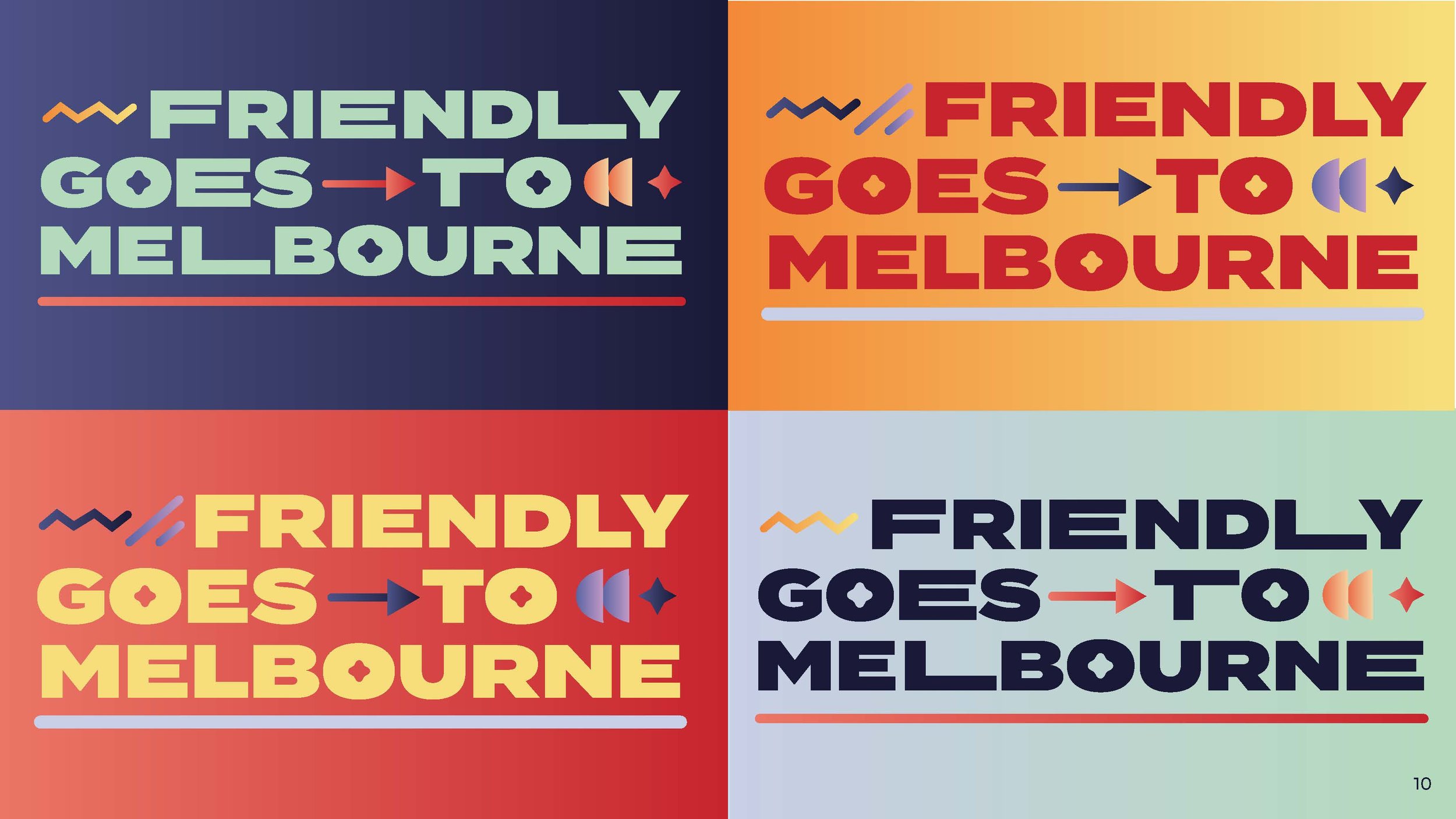
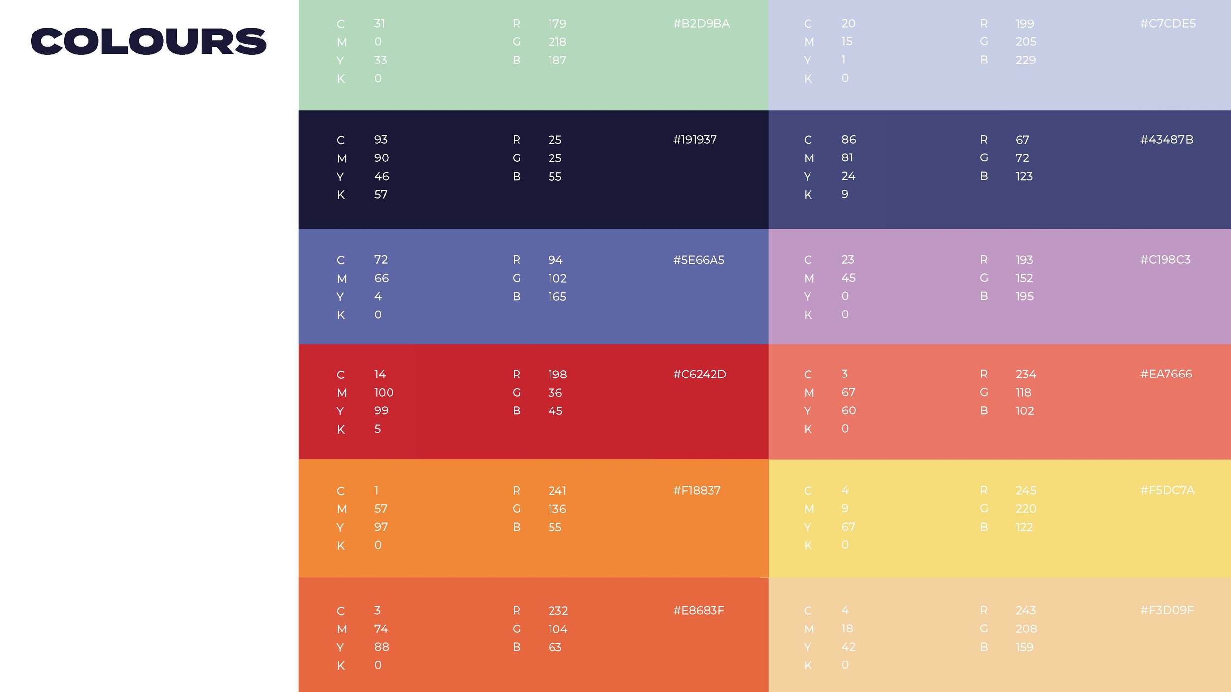
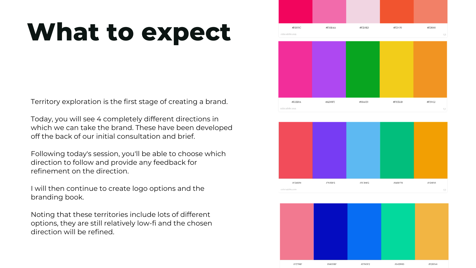
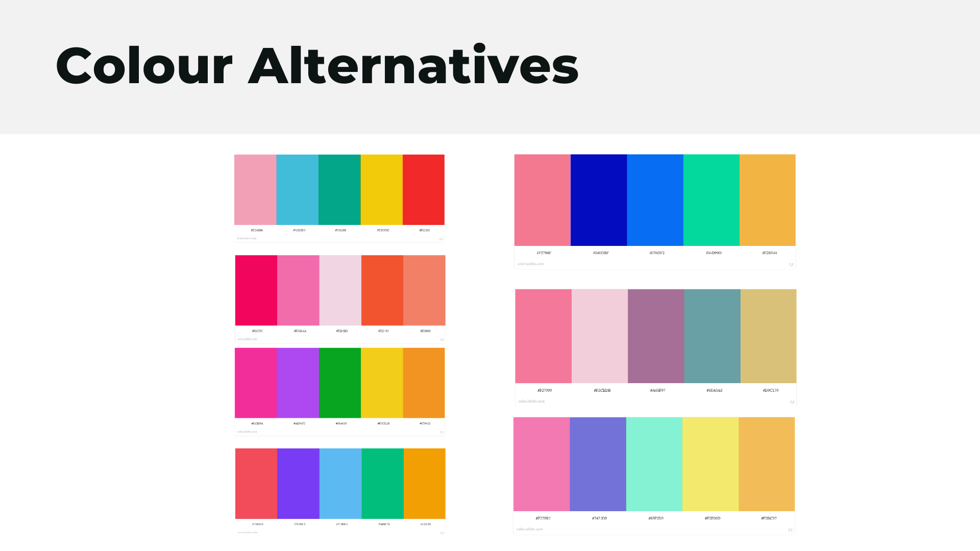
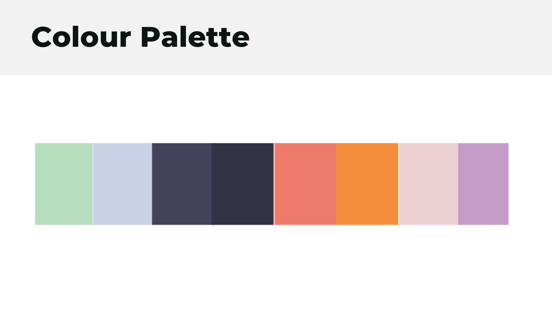
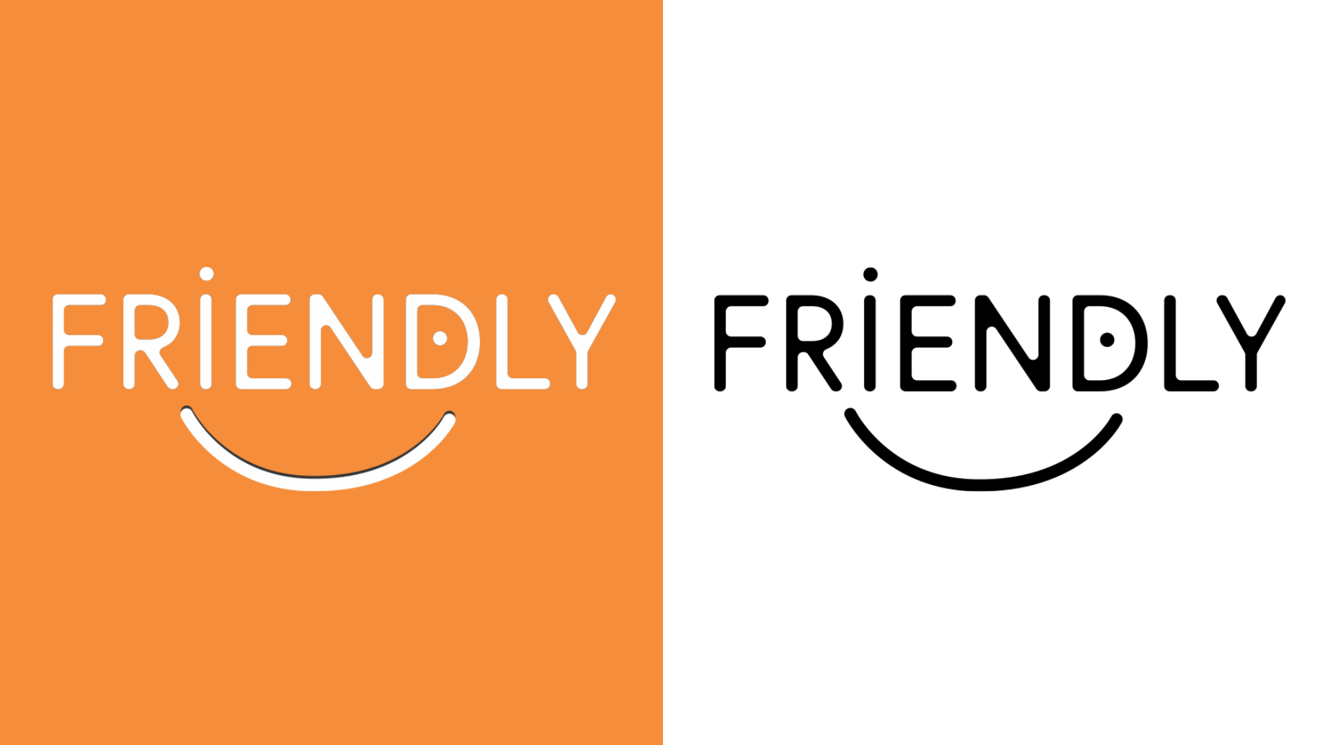
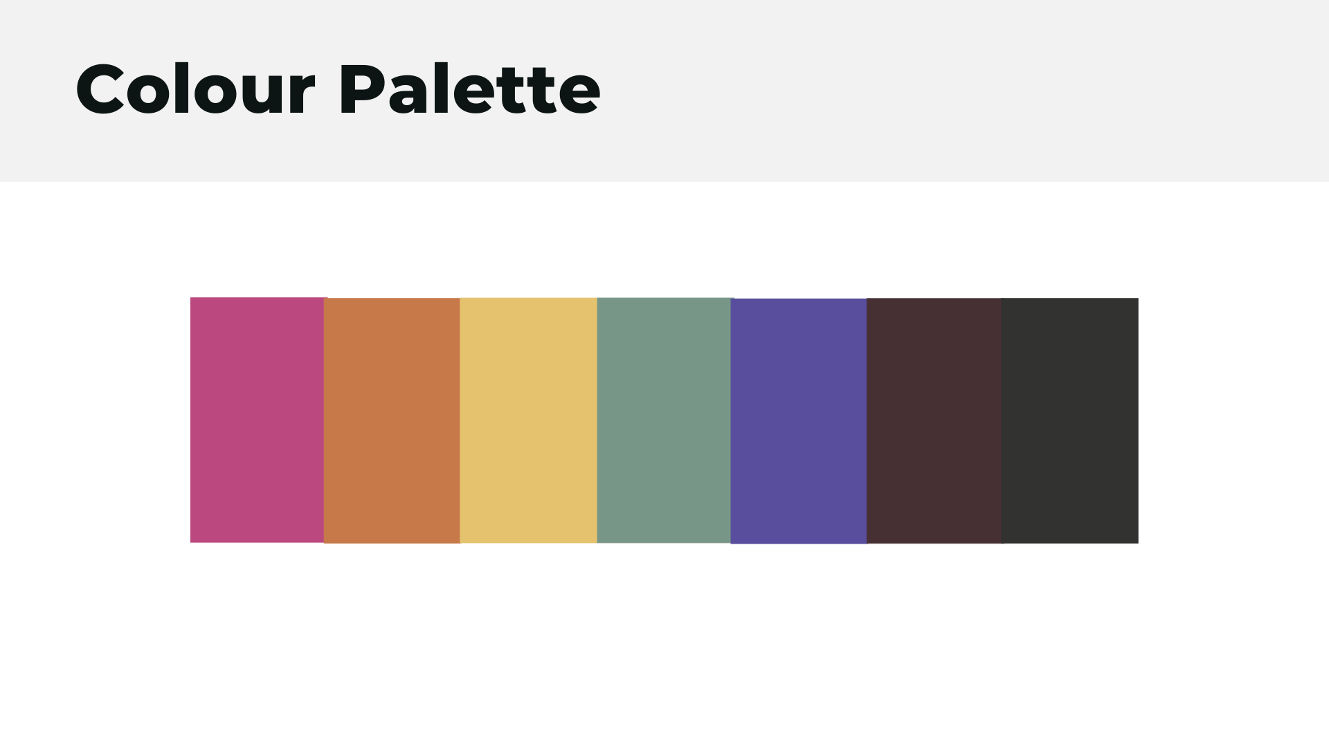
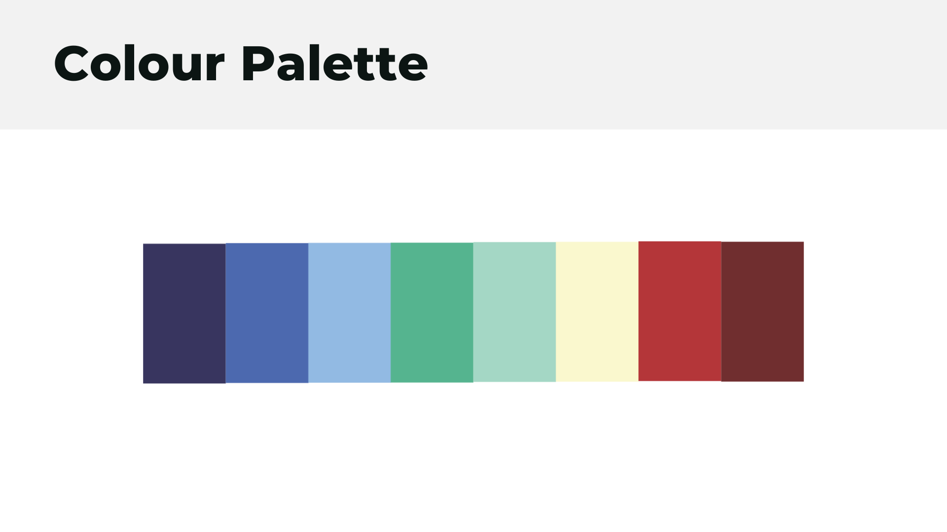
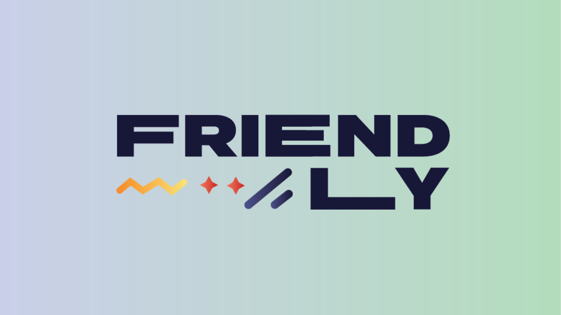
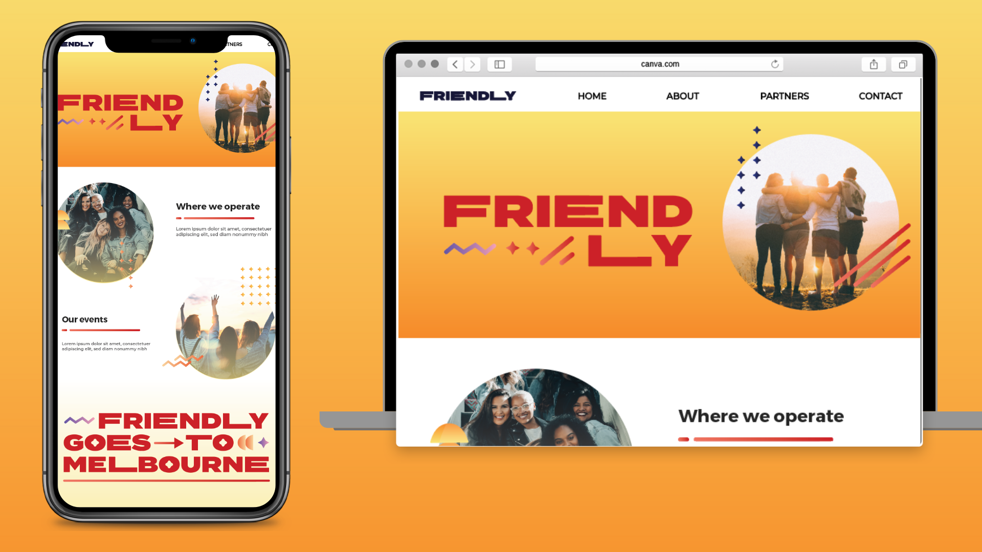
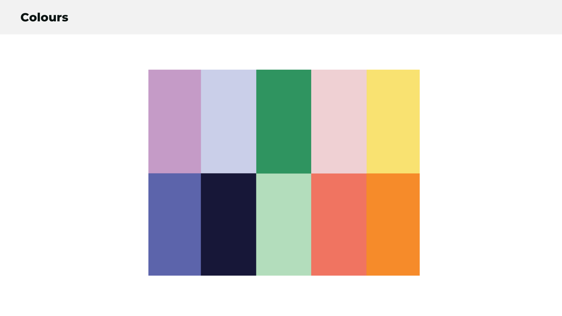
At this stage, we also explored 2 colour options, the cooler blues and greens and the warmer reds and yellows. As well as a series of logo options.
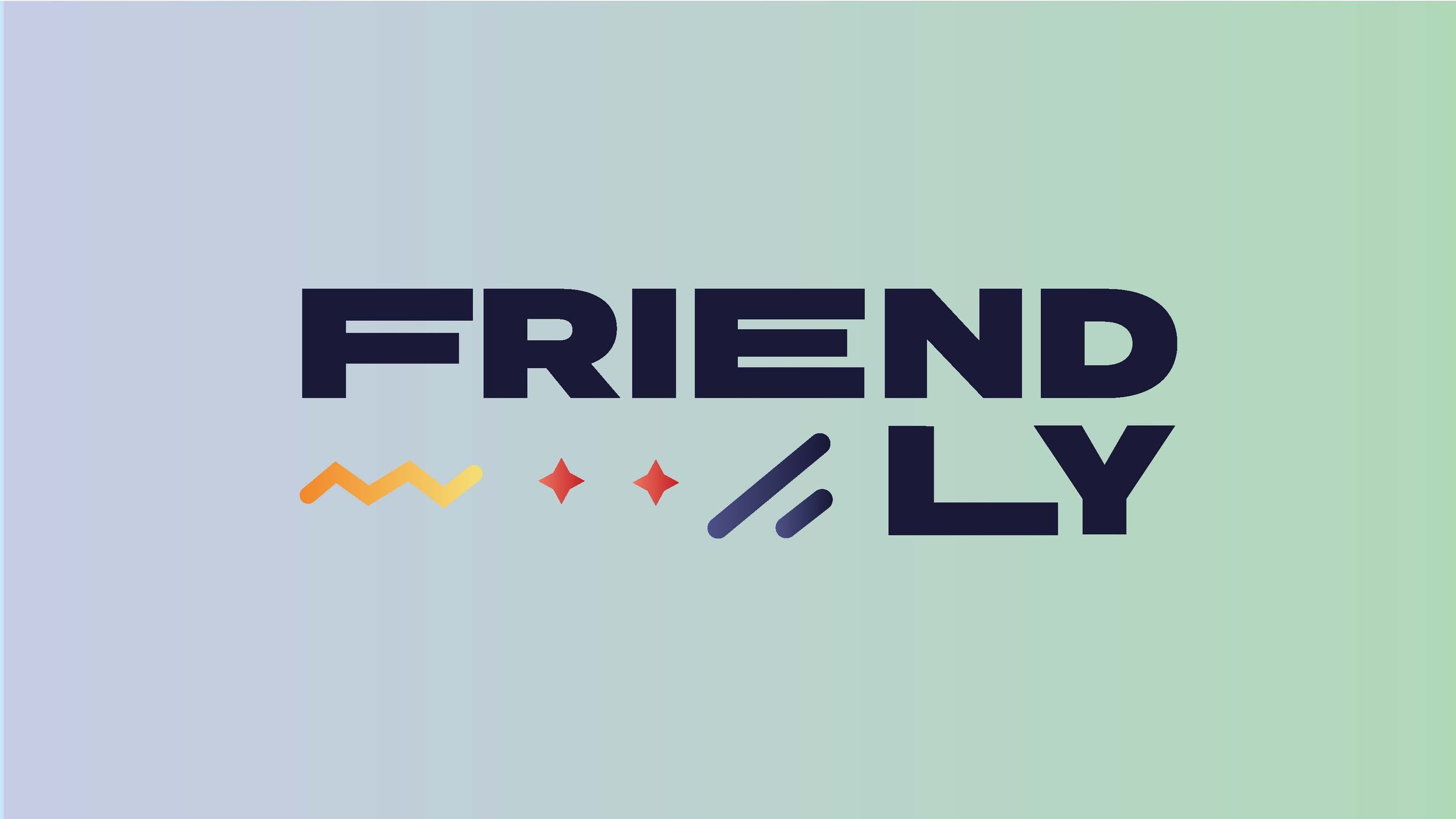
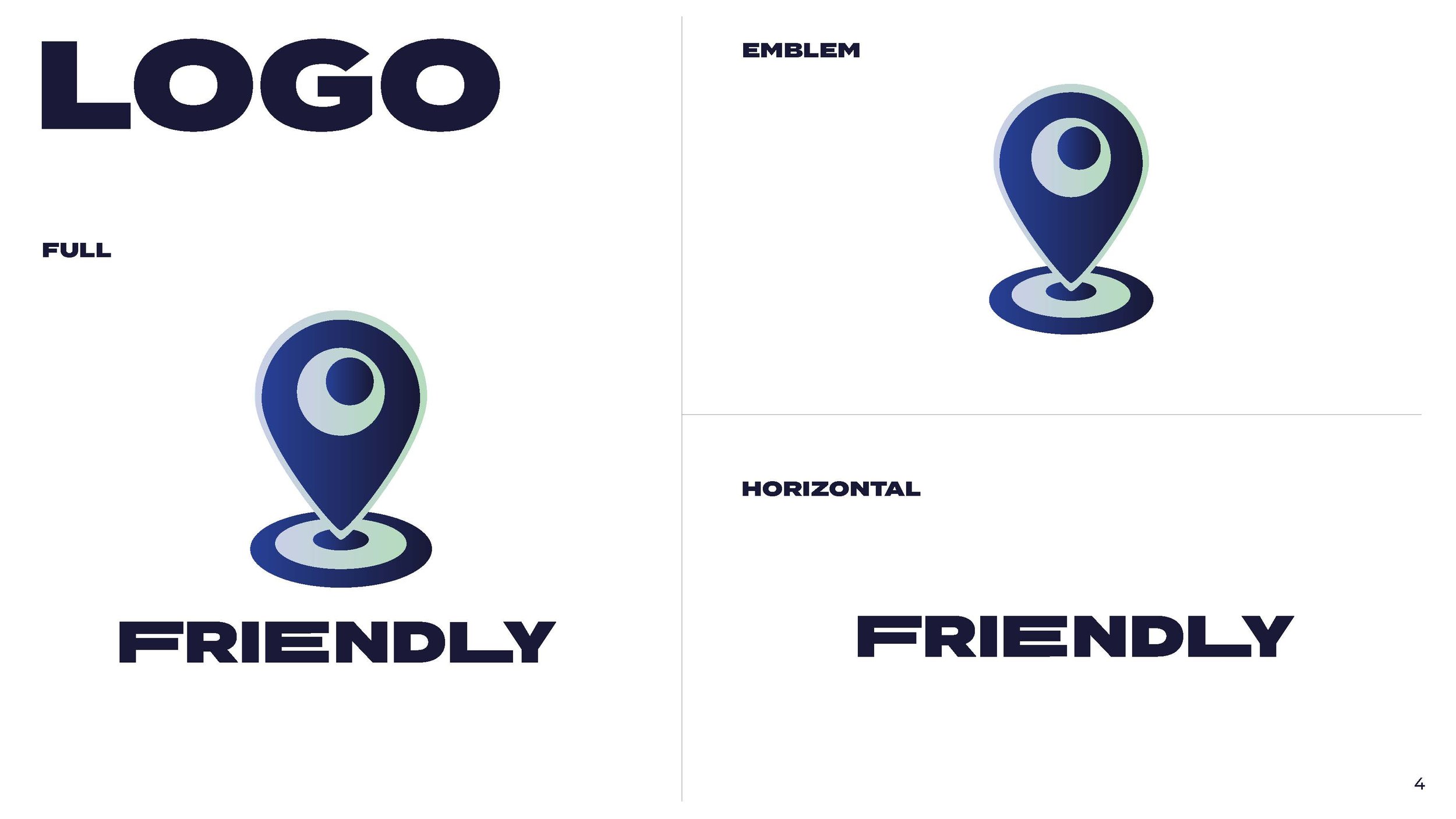
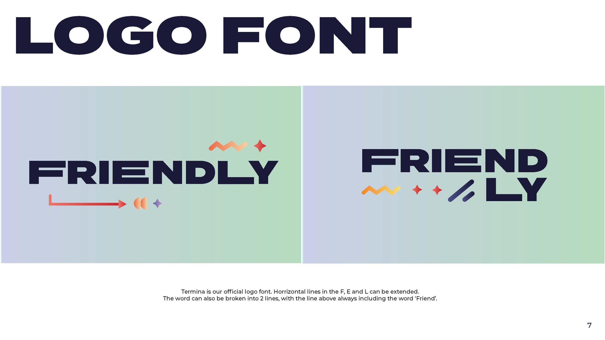
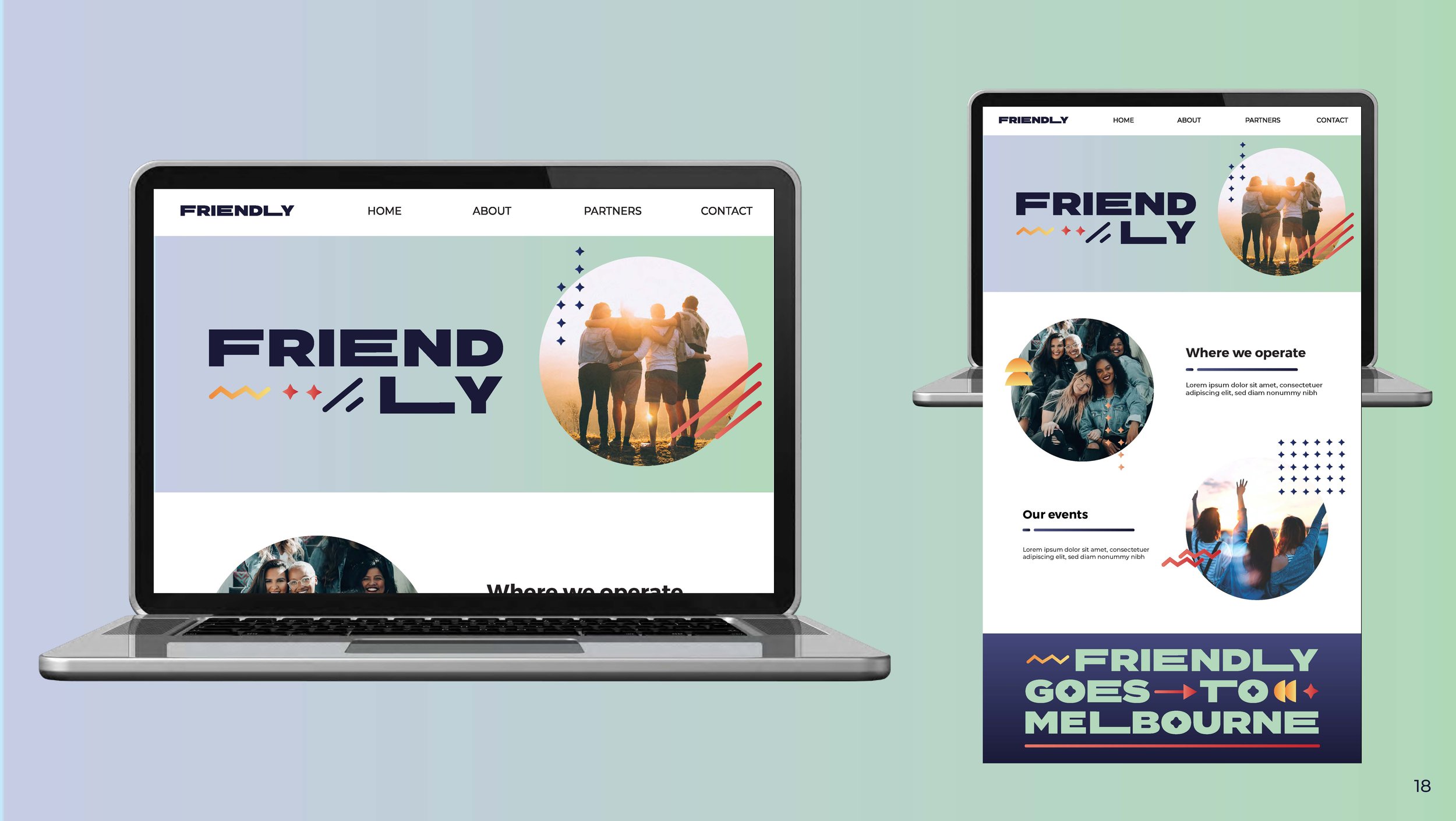
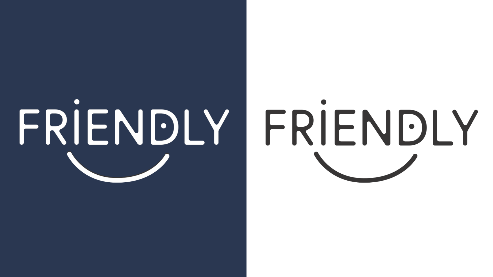
From here, the final round of feedback was taken from the Friendly team, to go with the blue colour way, they also chose their logotype treatment.
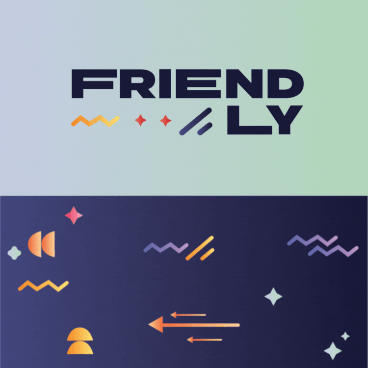
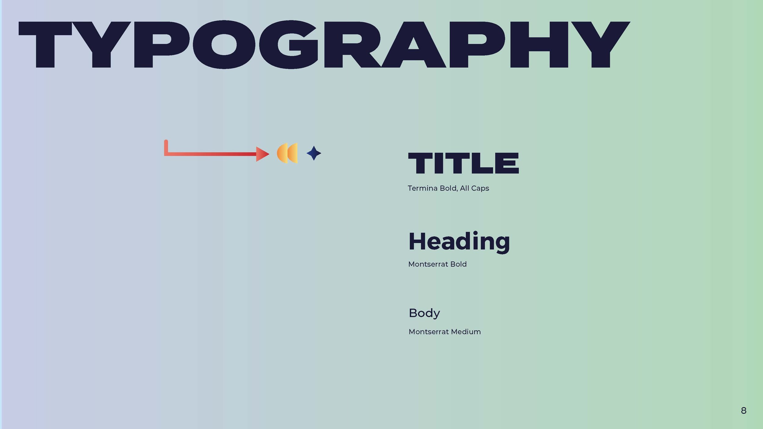
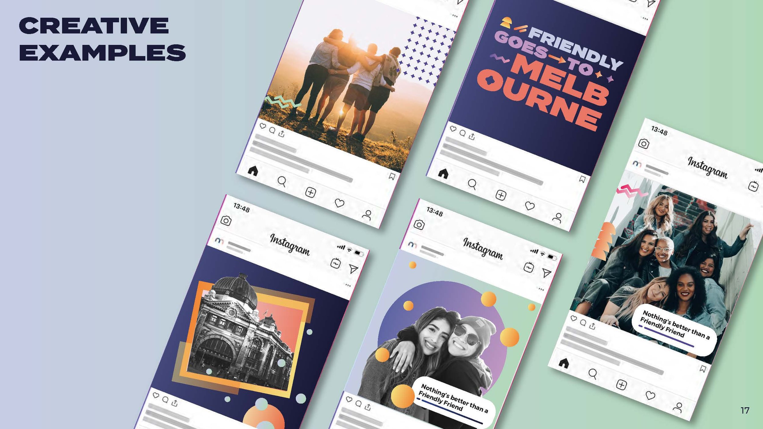
Finally, we produced the final brand book, which is shown at the top of this page.