The Healthy Human: Website Design
Case Study: Website strategy and design to include a blog, store, community hub and members area.
THE CHALLENGE
The Healthy Human (Mia) required a new website which reflects her array of services and showcases her unique selling proposition; empowering women through nutrition and wellness education.
The new website needed to include:
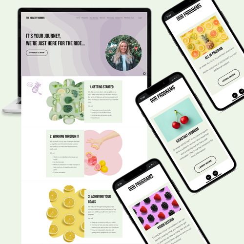
General pages where audiences could find out about Mia’s credentials, methodology and service options in 3 key packages.
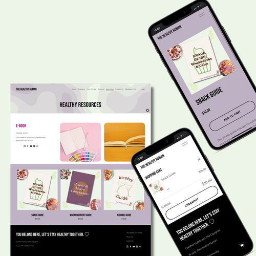
An online store with a clean and easy-to-use checkout process for Mia’s ebook and PDF downloads.
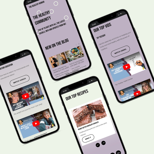
A way to bring Mia’s large social media following and content from Youtube, Instagram and her blog into her website space.
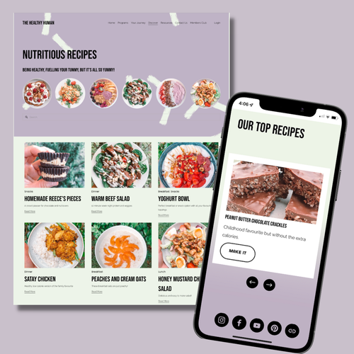
An area for recipes to be organised and accessed easily.
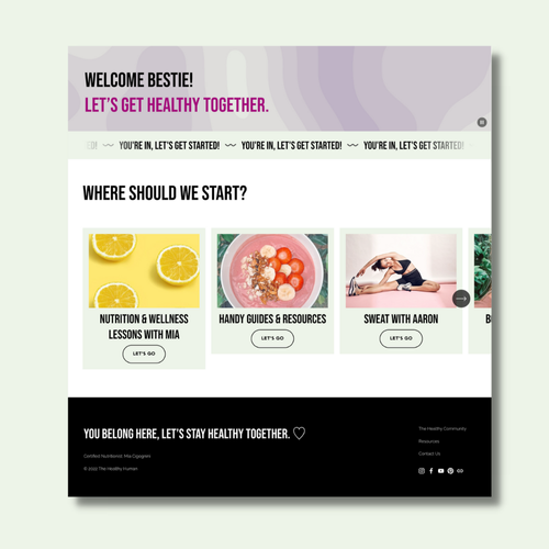
A members portal where customers who had purchased either a service package or an online membership would be able to access nutrition and wellness lessons in the format of videos, downloadable guides and workout plans through a partnership with personal trainer Aaron Vella.
THE SOLUTION
GENERAL PAGES
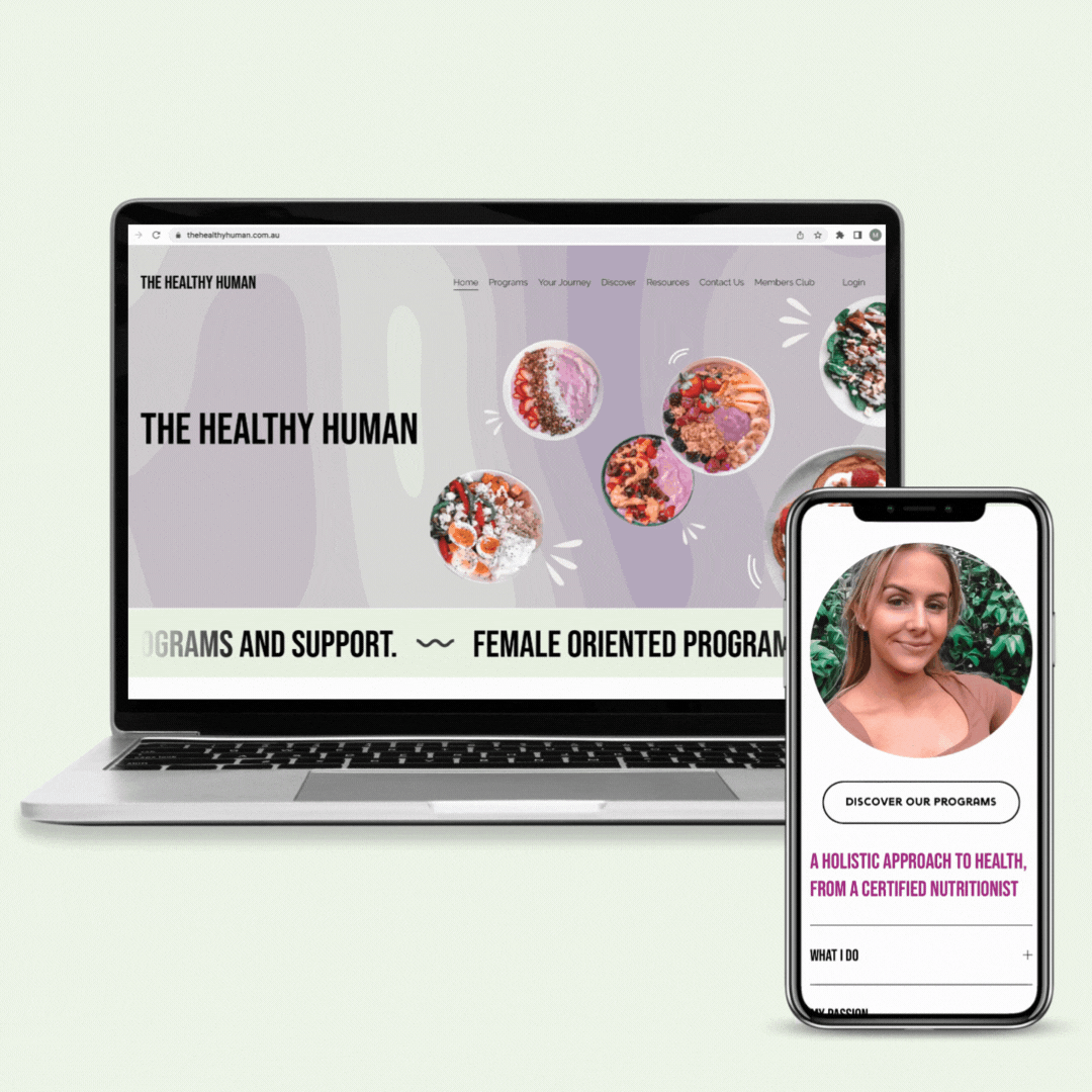
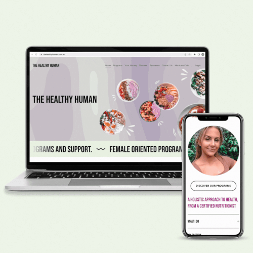
The Healthy Human did not have a clear or memorable brand identity, therefore we took the opportunity to shape this. Through colour theory and research, we came to the decision of using light green to represent new health and purple to enhance female empowerment whilst being strong. Key headings used fun and witty copy, maintaining the idea of a partnership between Mia and her clients through their health journey.
The home page instantly speaks to Mia’s credentials, approach and target audience. The program page provides critical information about each option for easy comparison. Each program with a clear CTA for purchase and consultation booking.
Through consultation, we found that most lost leads came from customers’ anxiety around the process and challenges connected to weight loss. Therefore, we added a page that speaks to Mia’s programs', supportive nature and a clear, concise breakdown of what to expect.
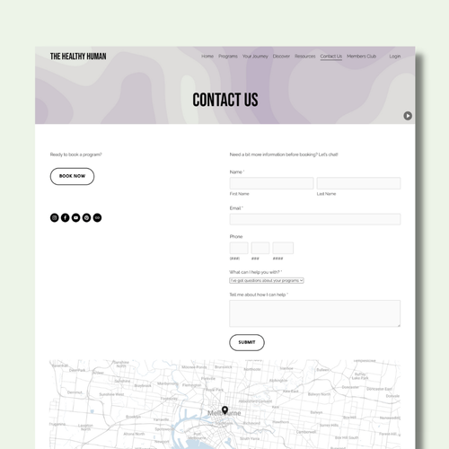
We also uncovered that Mia would spend a lot of time on admin which included manually organising client details, consultation bookings and billings. After discussion, we decided to add automation of program purchases and an online consultation booking system which pulls through Mia’s availability from her personal calendar. This would not only improve customer experience but improve Mia’s business practice, freeing her up for more time spent with clients. In the back end, we could separate program customers from digital download purchases.
COMMUNITY SPACE
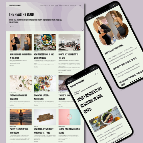
We created a discover section of the website, here users could explore a recipe page, blog page and community space which pulls through the latest YouTube videos, social content, blog post and top recipes automatically. The blog and recipe pages were set up in the same way with templates where Mia could easily input her content and schedule to post on a regular basis.
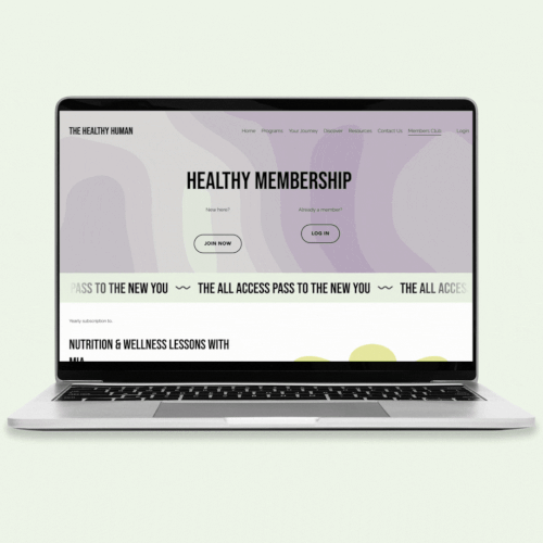
MEMBERS PORTAL
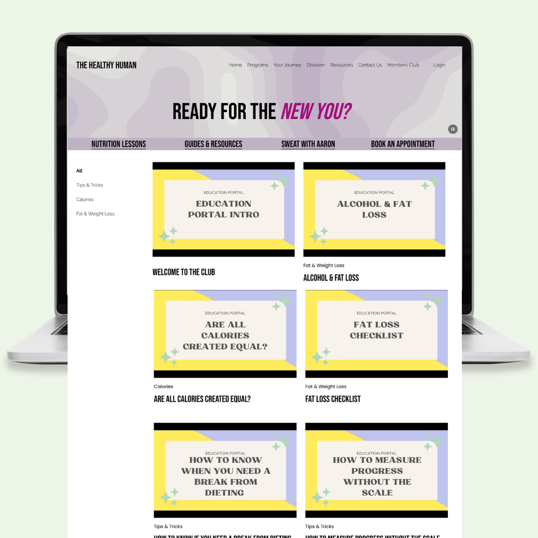
The members club needed a landing page for customers to learn about what the club is and how its resources can benefit them. The landing page speaks to each section of the members’ area with clear CTAs for easy signup and payment. Once customers become a member, they’re able to log in with their own username and password to access all resources.
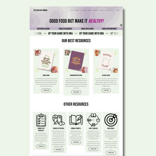
Mia provided a large amount of video content, from here we conducted an audit and tagging process where videos were sectioned into categories for users to navigate through and click through in order to complete courses. Each video also had descriptions for easy navigation.
Infographics were used to aid the navigation of the digital download page, with over 30 PDFs available for download, we needed short, sharp descriptions and CTAs for easy downloading.
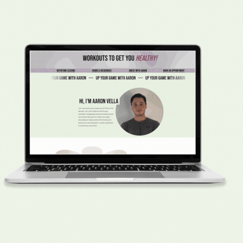
Aaron had his own page as part of the partnership where users could scroll through the different workout types and download the relevant workout guides. The imagery on this page included women exercising, starting away from the vibrant fruit images which had been established for Mia’s brand. However, the same basic fonts and shapes were carried throughout for site consistency.